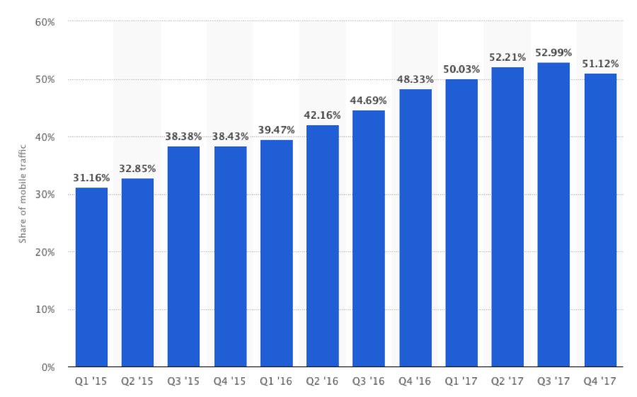
 We all knew this was coming. Trends for the last five years have forecasted it and many in the web design and development industry have braced for its impact. Mobile website views are dominating how your users are viewing your website. 2017 marked the first year mobile website views eclipsed desktop views coming in at 51.6%.
What does this mean if you don’t have a responsive website?
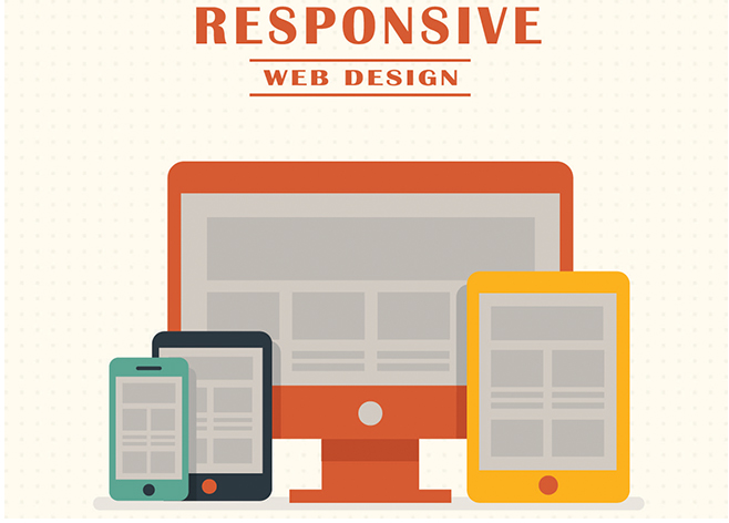
If your website is not responsive then it most likely needs a complete redesign. Some take the route of designing a separate mobile website however, the issue with this comes from a recent announcement from Google. Mobile first indexing means that Google primarily indexes your mobile pages and your desktop pages secondary. And that means? It means that having one fully responsive website insures all your main content is what Google uses primarily for SEO.
Speaking of SEO, did you know not having a mobile responsive website hurts your search engine rankings too?
Well it does! And if that fact isn’t enough to get you over the fence, check out the five ways responsiveness improves your website’s SEO:
- Improved Site Usability
If users can’t easily navigate your website, it’s unlikely they will stick around.
Google recognizes ‘time on page’ as a fundamental indicator of a site’s value for any given query. Responsive web design makes your website much easier for visitors to read and navigate. The result is an improved user experience and typically a greater time on site. A mobile responsive web design is fundamental to a positive user experience, and Google is going to reward sites that meet users with such an experience. Customer experience and site usability can’t be over-emphasized. Businesses must remain vigilant when it comes to conversion and customer experience.
Positive reviews, traffic, and a rise in branded searches – all of which can impact ranking – come as a result of customer experience. And beneath those factors lay the design elements of a website. Customer journey and customer experience are what makes businesses online succeed and mobile responsive design is the foundation upon which all experience occurs. Just as important is the fact that increasing site usability through responsive design not only satisfies users but is typically rewarded by Google with better search engine rankings.
- Faster Page Speed
Page loading times are an established and known ranking factor. Every website should be optimized to load as quickly as possible to help the odds of it ranking well in search engine results. The consistent message from Google over the years has been that fast-loading sites are favored in search results. That’s just one of many reasons why Google recommends using responsive web design. Websites that are mobile responsive will ordinarily load faster (especially on mobile and smart devices), resulting in a more positive user experience as well as a likely boost in ranking.
- Decreased Bounce Rate
Bounce rate is related to time on site. How quickly do your visitors backtrack or leave your website? Google pays attention to user behavior when it comes to entry and exit points for a website.
Google might interpret short dwell time (leaving a site almost as quickly as you came to it) as a signal that the content that the searcher found on your site wasn’t relevant to their needs. The consequence for the website will be a negative adjustment in their ranking in Google search engine results for that query.
But it’s not only the content that users are interested in. In fact, it could be argued that on many occasions, design outweighs content. The content may be magnificent, but if the design prevents easy comprehension, users will soon leave the site. A mobile responsive design enables you to not only put up relevant content for use but also display it in a way that is mobile device friendly. It provides a clean, crisp and undistracted environment for users to browse your website
- Less Duplicate Content
As intelligent as Google’s algorithms are, it still requires direction from you on which of your website’s content is most important. Those who have decided to go down the path of a separate mobile site have a difficult time managing duplicate content issues. Using a separate website for your mobile client requires using a separate URL. The problem is that the content on the desktop and mobile URL is the same, even though the URL is different. This duplicate content can seriously harm your rankings. If you do not make it clear to Google which content is most vital and ensure that it is the content being indexed, then they will have to decide for you.
The result is almost always lower rankings in search results. (Most separate mobile sites don’t rank well in search engines because they are canonicalized to their desktop counterparts, which is another benefit of responsive: you can focus your SEO on a single site.)A mobile responsive website deals with duplicate content problems. Write a single URL regardless of the device being used to view the content.
- Boosted Social Sharing
Responsive web design is built to make social sharing easy for the most dominant demographic online – mobile users.
Although social media can help SEO, social shares won’t have a direct impact on rankings. But it will help you grow an audience. A bigger audience can mean more traffic and engagement, as well as more search demand for your brand – which will definitely make Google take notice. A website that is not optimized for mobile and smartphone users is going to have a difficult time in convincing its users to navigate the awkward and poorly designed social sharing buttons that are designed for purely desktop use.
Thinking Ahead: Pre-Planning
Pre-planning your mobile responsive web design will usually result in a more concise and thoughtful design. It helps business to mind map your strategy and lay out the vision and purpose of the website before you start building it.
Pre-planning will also help you develop the vocabulary for your business, site, or service. That vocabulary will become important later on as you undertake your keyword research and mobile content strategy.
All of this is going to aid your SEO efforts by providing a much clearer strategy.
Who you are trying to reach and what you are trying to reach them with will be foundational to your responsive web design efforts and result in a more effective SEO strategy for your website.
Thinking Ahead: Auditing
The most insightful step in understanding where your website stands is to complete an audit of both your website and SEO. Through an audit you will be able to find your weak points and start building a plan to strengthen them. Here at The Goss Agency, we begin every new website design project with an audit to help build a solid foundation moving forward. We will not only do an audit of your website for free, but click here and we will send you the audit and translate it for you so you understand exactly what your SEO needs.


