By Eddie Maiale, Design Intern
Welcome back! We are reaching the end of this series on material design, and the information in the last sections of material design is not to be ignored as it is just as important as something like style and color. Today we will be going through some guidelines for a few components that most people have trouble designing. We will also be discussing how we can appeal to a specific audience through patterns in our layouts and design choices.
Navigation. It is one of the most essential pieces in any application or site and should not be put off to the side so lightly.
Google suggests that, when creating a navigation bar, that we follow some of these conventions:
Use a bottom navigation on smaller devices while keeping the navigation limited to about 3-5 top priority items. Try not to use two navigation items and create tabs for those instead. For clarification, items are what we call the buttons or text you click on located in the navigation.
Tabs are similar to filing tabs but on a website we just click on the tab (For example, when you look on an airline website most will have tabs to separate between booking flights, hotels, or renting a vehicle). We also want to let the user know what section of the application or site they are on; visual cues are a great way to show that. One great way to use visuals to guide the user or inform them is with color, or lack thereof.
An example is in the picture below where we have three navigation items, one is colored in and the others are greyed out. Can you guess which section we are in based on the image? Yes, we are in the favorites section! Google takes this from the norms in web design because, as a web designer myself, I always try to guide the user smoothly across any platform using visual cues. This most certainly is not a new idea, but it grabs all of the knowledge passed down from many years of experienced designers/developers and puts it together in one collective for all to see. Creating an amazing navigation takes research, a significant amount of research at that. To make the users experience enjoyable and functional when needed, we must research common patterns or trends within your website or application. We should then take these statistics and reorganize paths or navigation items to better suit the needs of our users. Learn more about navigation and the specifics here.
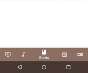
Do this (5 or less items)
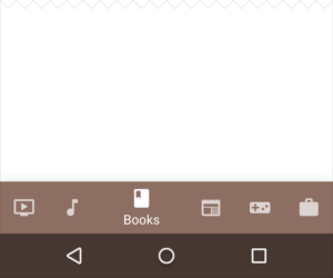
Rather than this (6+ items)
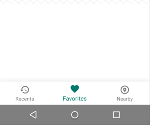
Colored in navigation is used for clarity. Do not color in all navigation at once because it becomes too busy and confusing for the user.
Next on the list are our menus. Menus are important in our designs because it will either help the user or confuse them, causing users to not use your website or application. Google tries to simplify the confusion by giving us tips on how to layout the menu and what to use in the menu. For example, when making a layout for a menu we should think about the labels that are going in, never using more than one line for each label, unless absolutely needed.
Make the menu consistent throughout by making it wide enough to fit the text for all labels without having to resize just one label to fit it. Give a clear indication of whether something is enabled or disabled as needed (such as greying out certain actions where needed) and titles of each menu are descriptive enough for a user to recognize with ease (Such as “File” or “View”). Another important piece of information to keep in mind is that you do not want to be repetitive, so do not repeat a selected menu item. More on menus and their specifics can be found here!
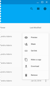
This is an example of a contextual menu.
Material design offers new and old designers/developers alike a new perspective on application/web design. There is much more about material design that you can learn about here. I just scratched the surface of what you can do with material design and there are many resources that you can use to help with your next design!
To find out how The Goss Agency can make your website more beautiful, responsive, and user-friendly, email Dari Mullins at dary@thegossagency.com or give us a call at (828)259-9910.

 - https://thegossagency.com/2016/06/16/what-is-material-design-part-3-of-3/)