By Chloe Ayres, Head Designer
AirBnb, Tinder, Yelp! – all of these apps provide location-specific information content on a global scale. All of these companies have also adopted the “McDonald's model” of “a burger should taste the exact same in every McDonald's.” While consistency is certainly key in establishing a strong brand identity, it also leaves very little room for a local, digital experience to become a personal one--one that gives you a taste of the personality of the location.
Uber, one of the fastest-growing apps that serve local content, is taking a bold step in a different direction. Uber recently annouced that they have rebranded to meet the needs of the company that they are right now, as opposed to the company that they were when they first came out with their black and white logo.
As Travis Kalanick, Uber CEO and Co-Founder, writes: “Uber began life as a black car service for 100 friends in San Francisco—everyone’s private driver. Today, we’re a transportation network spanning 400 cities in 68 countries that delivers food and packages, as well as people, all at the push of a button. And thanks to services like uberX and uberPOOL we’ve gone from a luxury, to an affordable luxury, to an everyday transportation option for millions of people.”
Realizing that this one company now serves as so many different things to so many people, Uber decided to diversify their visual identity enough that it could be personal, but at the same time feel like a global brand.
The first change that they made was to update their logotype. Their new look is sturdier, more streamlined, and closer together--much like their new focus. This logo will represent the company globally, without individual local identities, which is a smart choice.
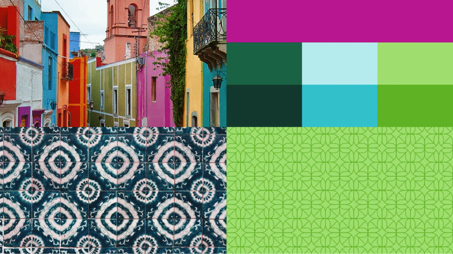
 Secondly, Uber has introduced country-wide color schemes which have been carefully researched and created to reflect the history, personality, and day-to-day life of each country. For instance, as Kalanick writes, the Mexico color scheme was inspired by “Mexican pink and the patterns in the local tiles.” This change is a huge step forward in personalizing a huge brand like Uber.
Lastly, Uber has divided its app into two different apps – one for partners, and one for riders. At first, the riders far outnumbered the minimal number of partners, but that is simply not the case in the Uber of 2016. Uber adds an average of 50,000 drivers per month. In fact, Uber is the most popular job for actors and models in LA because it allows them the flexibility to work when they are able – a need that is also reflected in the number of college students that have started to drive for Uber. There is even a page on the Uber website dedicated to the benefits of driving as a college student! The more partners Uber has, the more money Uber makes. Period. So, they have decided to “localize” their partner service to one app, separate from the rider service. They are making their global brand work for individuals.

Driver App
Uber says their ultimate goal is to “celebrate the cities that provide Uber services,” but I think they have accomplished something different entirely. I think they have given the world a new idea of how a global brand can become provide a localized, more personal experience.
To read the entire letter from Travis Kalanick, please click here.


