It seems odd that some of us are still struggling to write “2016” instead of “2015” on our documents, but we are almost a quarter of the way through the year. As we settle in to the new year, new trends are emerging – new ways of finding friends, new ways of using technology, and new ways of getting around. However, the most exciting thing to me, as a designer, are the new trends in design.
The new design trends for 2016 can be summed up in a few words: bright, geometric, clean, and historically-conscious. (Tweet this)
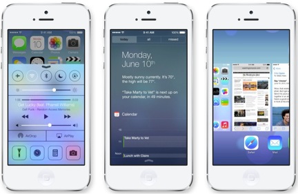
One could say that the bright, clean, flat aesthetic really broke back onto the scene with the redesign of the iPhone in 2013 by Jony Ive. That may be true, but it takes a while for a trend to become an innate part of our social subconscious. As Madeline Morley at The American Institue for Graphic Arts (AIGA) says, “A trend never simply emerges for a single year and then disappears in a puff of smoke. Instead, an aesthetic becomes popular gradually, even mysteriously, over time before fizzling out slowly without much notice at all.”

This trend has in no way fizzled since Jony Ive got the ball rolling in 2013, but designers are starting to build on it. Ive’s extreme minimalism was a reaction to the crowded, maximalist design of that characterized the 2000s; it was a return to the classic elements of design – clean lines, space, geometry and proportion, just spiced up with a dash of modern color.
Designers today are slowly and carefully putting more pieces in the puzzle, trying to construct a new maximalism. This new maximalism is extremely considerate of space, and puts more emphasis on color and texture. Depth is created by lines and color, not by drop shadows. Typefaces are decorative and retro, but have modern corners and kerning. This is design visually learning from its mistakes.


