By Eddie Maiale, Graphic Design Intern
Since its debut in 2014 at the 2014 Google I/O conference, you may be wondering, what is Material Design? Well, there are many ways to describe what it is, but let us start from the beginning. Material Design is a visual language created by Google that attempts to synchronize and simplify good design visually. Another way to explain Material Design is a responsive Android application development language to help designers keep their designs fluid and responsive on multiple screen dimensions while keeping a familiar look and function for users. The best way that I can describe this style of design is minimalist with a touch of depth. As described by Google, Material Design is “a three-dimensional environment containing light, material, and cast shadows.”
Here is an example of a Shadow Video:
Carrying on, we must now explain what “material” is in Material Design. Material can be better understood by using the term “environment” because that is what it is, any 3D object that takes up space with an x, y, and z dimension. The standard thickness of said object in Material Design is 1dp, or one Density-independent pixel. Density independent pixels are flexible units that scale depending on the dimensions of a screen - think responsive web design, but specifically for Android applications. These objects case two types of lights: key (directional shadows) and ambient lights (soft shadows). In Material Design, we combine these types of lights and each material keeps the same thickness but as the material changes its elevation, it casts a larger or smaller shadow. It is the same concept as a shadow in the tangible world; if closer to the light source you cast a larger shadow, otherwise the shadow shrinks. This contests the typical manipulation of the y-axis to cast a shadow.
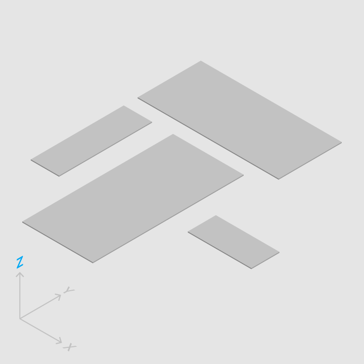
Do (All thickness is uniform):

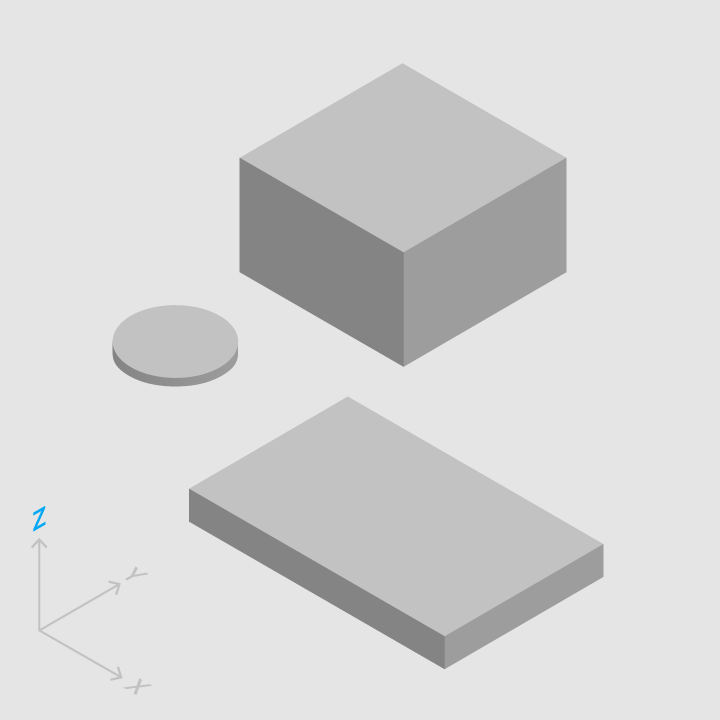
Don’t (Thickness is more than 1dp):

The x and y dimensions of material can be manipulated, but the uniform thickness (1dp) may never be tampered with. Content within the material is limited to the bounds of the material, and material may change shape as needed. Although material may change shape, it must not occupy the same z-axis point at any time, as material is solid and impenetrable. It can be moved and split as long as there is no point where the material is occupying the same point in space but material can be split and combined to the original shape. Typically, z-axis motion only occurs with user interaction and has a “resting elevation” and a “dynamic elevation”. A resting elevation is the default elevation of an object and the dynamic elevation is the goal elevation of that object. For example, when the user sees a button on an application, that is the resting elevation, let us say the resting elevation is 4dp. When the user taps or clicks on the button, it (generally speaking) “pushes” downward, let us say the dynamic elevation is 1dp. The button starts at 4dp, when the user taps or clicks the button it moves down to 1dp, and then it moves back up to 4dp after the user let go. Motion is an important aspect of Material Design as it keeps the fluidity in an application design.
Here is an example of a Motion Video:
Motion in Material Design is all about the natural flow or movement of objects. More traditional motions or animations are generally linear and ridged. With Material Design we have a more natural ease to a motion. Objects speed up and slow down, as if affected by weight and friction. Movement may also play a crucial role in communicating to users of an unavailable action such as not being able to move an object. Rather than not moving at all we get a small notation that it is not available by slightly moving towards a specified direction to alert the user that the material may not be moveable. Motion may also prove to be useful in getting the users attention, such as an alarm or a phone call. In material design motion is quick. It does not slowly stagger objects into place; rather it quickly pulls up the necessary information that a user is trying to access. When there is too much motion going on it can confuse the user so Material Design uses synchronized motion and maintains a clear path to the next menu or element. This motion should be similar throughout the application. When transforming elements by expanse or collapse, motion should use asymmetric transformation where the height and width (x and y axis) change at different rates. The most important point that Material Design with motion makes is this: if the motion does not look natural, change it to look natural.
To find out more, go to Google’s tutorial pages here: Material Design
https://www.google.com/design/spec/material-design/introduction.html

