Business to Business

CASE HISTORY
By compiling data and available research, some conducted by the industry and some by Amoco over the decades, we repackaged and presented this information on their website and collateral in an informative and educational manner technically helpful in executing and specifying a project for civil engineers. Thus, Amoco Fabrics and Fibers was established as the authority in geo-textiles and it was a risk to do a job without their knowledge. This positioning was carried out in direct mail and ads in industry publications that struck the emotions surrounding the risk.
Positioning: “The superior engineered wire, freeing you from time, worry and concerns surrounding fencing and repair.”
Creative Platform Directives:
- Headline/concept messages: The messages identified with the rancher’s and farmer’s emotions leveraging the strengths/benefits of the wire with intelligent, humorous thoughts that animals might have when fenced in with Bekaert wire.
- Design Directive, steely blue photography: Images were shot to promote the cold, hard, tough nature and construction of the wire. We wanted to say steel and blue not only did it; but it stood out in publications among the competition’s more expensive predictable 4- color images. Typeface: We used a powerful, no-nonsense san serif headline face to promote strength and control. The headline was reversed out of the duotone bleed images in a size that did not compete with the image.
- Logo: We crafted individual Brand logos for the Bekaert product lines. For the field fence and barbed wire we created the name “Gaucho” and crafted a trademark to resemble a branding iron mark, a symbol of the old West for containing cattle. It was especially effective since our research revealed that our targeted traditional ranchers perceived Bekaert’s higher tensile strength steel wire as weaker because it was smaller.
- Positioning Line: “The Superior Wire, There’s No Escaping It.” This line captured the spirit of the ranchers and the old West by displaying guts and confidence.

There was an unmet need for a paper chemicals manufacturer who appeared friendly and less “chemical.” We helped Eka Nobel take the position of owning products that allow smoother operation and less downtime, requiring less maintenance and offering better performance.
Empathizing with the customers’ pressures and concerns, we positioned Eka Nobel as the leader in the category through ads and posters for the plant break rooms and offices.
TESTIMONIAL
“The new corporate identity, clear and focused message, and the branding that you created for us have been very helpful and powerful for us. We have seen that we now attract more interest in the marketplace and that we have increased credibility.Furthermore, the message is clear enough that we have been attracting the kind of clients we desire most and not just raw numbers.”Your work has allowed us to generate a more dynamic, techy, and partner-like image in the global marketplace. I feel that the increased international interest, inquiries, and business we have seen are a result of this marketing program. The web site you designed is unique, very effective and well received. The branding, identity, web site, and sales materials affect the way the world perceives us. I have definitely seen increased market interest and confidence, which will help generate and assure our future success.”
- Neil Farnam, CEO, Farnam Custom Products
CASE HISTORY
Challenge: Farnam Custom Products in Arden, NC, is a customizer of industrial products — a niche player that sells special products/parts that can be significantly modified.Farnam needed to move more towards higher-volume products while not giving up its “customizer” niche. Was it possible to do so without giving up its point-of-difference as the “ultimate customizer”?
Solution: Interviews with Farnam’s customers uncovered its marketplace strengths:
Position Farnam as the cost-effective solutions provider offering.
We recommended that Farnam continue its role as “ultimate customizer” while inching towards more standard applications, as long as these applications allowed and encouraged liberal modifications.
- Results: Eighteen months into new Brand Positioning, sales were up 25%, attracting international acquisition opportunity. Advertising was placed on hold to catch up to
back logged orders.
- Headline/messages: Messages/concepts were written to leverage the custom solution that Farnam offers and elevate the distinctive Brand positioning. Messages/Headlines promote the features and benefits of the Farnam Custom Solution in a way that touches the emotions of the prospect by appealing to the intelligence and fear of the target by raising the risks of making the wrong decision as compared to the better results of a custom solution.
- Design Directive: Cream PMS background denotes warmth for the nature of the product and the company employees from the top down. Graphics: Colors and design denote energy, complexity, depth, heat, and the use of technology to arrive at the best custom solution.
- Logo: Bold san-serif “F” is simple, powerful and memorable, leveraging leadership positioning. The combination of orange and red create the effect that the logo is glowing hot.
- Positioning Line: “A higher degree of performance” elevates the Farnam Custom Solution as the best solution with a message of no compromise when it comes to your business and career, thus leveraging the strengths and benefits and supporting the newfound position of Farnam Custom Products.
Preceding deregulation that allowed Georgia Power customers to choose power companies throughout the Southeast, Georgia Power decided on a preemptive strike. Even though solid relationships had been established, there was still concern about some defection.
After a thorough customer study, it was decided to take the high road and remind customers of the support and resources lent by Georgia Power day-to-day and especially in a crisis. Actual examples were used for a series of ads placed in the Wall Street Journal. The portraits of the Georgia Power Representatives were etched in the same style and by the same illustrator of the Wall Street Journal, giving the campaign stature and credibility.

TESTIMONIAL
“In the category of international food brokerage, we were facing competition focused on one category of food with budgets triple ours while our budget was to be spread over four categories. We needed a lean, experienced, superman agency. A director of marketing who are a close friend and associate recommended the Goss Agency to me. After a search and review of four agencies, our team of eight unanimously elected to work with Jeff Goss at The Goss Agency.
“Jeff’s team wrote our marketing plan and media strategy. With a combination of outstanding creative and media strategy, they showed us a way to increase our customer base of buyers and sellers 18 percent in six months. They changed the way the most dominant magazine in the restaurant category sold its ads in order to accommodate our unique buy. We executed a schedule of small space ads in the Wall Street Journal targeting the C level of the food industry on the commodities page, creating sell-in from the top as we targeted buyers and sellers, never done before.”
- Karen Fox, Director of Marketing, Global Food Exchange
CASE HISTORY
With The Goss Agency, Global Food Exchange.com avoided the “.com” negative profiling before it was even known to be a negative. Objectives and sales goals were established. Senior marketing at TGA extensively interviewed Global Food Exchange’s management, marketing and sales teams and reviewed the food trade industry from a traditional and web technology perspective.
From this exercise, it was determined there were two distinctively different targets (CEOs of the big food companies and buyers/sellers of the individual food categories).Two separate strategies and media approaches were required to complete the sales cycle and reach goals.
Brand positioning was defined on expertise, not the technology to implement it. From this positioning, a series of six ads were designed to create a monologue with the buyers/sellers of all categories of food, addressing their identified concerns and needs.
Publications were evaluated. An innovative media strategy was created that not only changed the way Super Market News sold ads, but established reach and frequency above competition who were spending four times as much as Global Food Exchange and only focused on one category. A small-space campaign was designed for the Wall Street Journal to reach the CEOs of the food industry on the commodities page, a tactic never done before.
TESTIMONIAL
“We selected The Goss Agency to spearhead the Massey Ferguson re-branding assignment because of the agency’s ability to conduct the necessary research that helped us position the brand correctly and to create an exceptional creative product. The new Massey Ferguson campaign is among the best in the agricultural industry, and I'm confident that it will deliver against the objective of creating a new image for one of our most important brands.”
- Doug Durand, Manager, Marketing Communication, North America, AGCO Corporation, Massey Ferguson
CASE HISTORY
Challenge: Due to declining sales for Massey Ferguson tractors, AGCO was strongly considering merging this long-established brand into its new line of AGCO agricultural tractors. A proposal had already been made to start this process by changing the color of the Massey Ferguson from red to orange. Was there any Massey Ferguson heritage left worth leveraging in a market so dominated by John Deere?
Solution: Three hundred phone interviews were conducted with farmers in 26 states and were followed up with Inside Insights© Focus Groups. Massey Ferguson Heartland discovered that the Massey Ferguson brand still had a heritage for quality among farmers over age 40.
The brand positioning became: Position Massey Ferguson as the pinnacle of reliability – reliable products and reliable people from a reliable company with a coveted heritage. Focus this reliability on the benefits of “consistent performance” and “long-lasting dependability.”
Results: We discovered that it was detrimental to sales to describe the tractor as “rugged and long-lasting,” which was a previous theme for the brand. One year after the incorporation of the new Brand Positioning, Massey Ferguson Equipment sales were up 9% and Brand awareness up 31%.
AGCO, Massey Ferguson Tractors and Equipment (Norcross, GA), Positioning: “The pinnacle of reliability on the farm. You can depend on your Massey Ferguson.”
Creative Platform Directives:
- Headline concepts: Headlines identify emotionally with the prospect’s needs and concerns while leveraging the Massey Ferguson Tractors, Equipment and Dealers positioning, “What to depend on when everything depends on you.”
- Design Directive, Border: Rich, full-color, bleed, warm, orange and red images of farm scenery identifies with farmer’s lifestyle. Colors are directly connected to product leveraging the Massey Ferguson colors, verses competition. The images are stylized, creating the mood and feeling of the responsibility and demand of life on the farm. Graphics: The three-triangle graphic from the Massey Ferguson logo is utilized for “Brand Awareness,” large in the ad’s negative space incorporating sepia tone images of the dealer, farmer, and equipment. The sepia toned images reflect the heritage and values of the farm, tying Massey Ferguson to heritage, pride and values of the farm. Typefaces and sizes: A small, bold, san serif Helvetica type was chosen for the headline concept messages. This type communicates our concept message headlines in a confident, yet non-arrogant manner. Research clearly indicated that farmers don’t want to be sold. They want to be related to, and supported. They trust their neighbor and usually purchase on recommendation. Thus, the body copy is written in an atypical, non-commercial style with loose, flowing lines, staggered to read as one might talk to you. Logo: Our “Benefits Testing” revealed the dealer and service was as important as the tractor equipment. We underlined the logo with “Equipment and Certified Dealers,” thus combining and branding Massey Ferguson with its dealers and service.
- Positioning Line: “What to depend on when everything depends on you” empathizes with our target that has told us they have a terrific responsibility and pressure and no one to share it with. We put something under them to offer support. The Massey Ferguson tractor.
TESTIMONIAL
“After an agency review of notable advertising agencies for effective creative and brand positioning, we hired Jeff Goss of The Goss Agency to execute our brand message in advertising and trade show graphics materials. The campaign was instrumental in assisting us in bringing CNN on board as a marketing partner.”“At the Javitz Center in New York, the trades show graphics were designed to leverage our unique offering. Our goal for the show, with seven salespeople on the show floor, was 300 new contacts. The outcome from the advertising campaign prior to the show and the show itself was 475. We consider it a success. We highly recommend The Goss Agency for positioning and creative that defines your brand and leads to results.”
- Joe Michael, CEO, Nexchange Corporation
CASE HISTORY
Founded in 1996, Nexchange Corporation is changing affiliate marketing by connecting buyers and sellers on a network of over 75,000 online stores. Using Nexchange’s patent-pending technology, Web site owners open retail stores within the relevant content of their sites -- generating revenue without ever losing their visitors. Retailers include Proflowers, Ashford.com (Nasdaq:ASFD), and Just For Feet among others.Upon completion of consumer insights analysis, the position was identified for Nexchange to take leadership in enabling on-line retail without losing the customer. Also it was determined that what was most important was to communicate this key benefit in simple, uncomplicated term. A series of ads and direct mail were created. Rather than inform the prospect that they could keep the visitor to their site from leaving, the direction was determined to communicate our limitations, where we could not keep them from going, the restroom.
After a thorough review of the industry and customer insights, it was clear that no one fowl processing manufacturer had taken the throne as the premier provider of service and quality equipment, even though the efficiency of the equipment was directly associated with production and, ultimately, the success of the customer’s business and the plant manager’s job security.
Stork, with the graphic look of a Swedish sports car, claimed this positioning for itself. Messages touting the company’s expertise and appealing to the emotions and concerns of the plant managers were developed and placed in direct mail and industry publications.
TESTIMONIAL
“After analysis of our customer research, the creative and strategic team lead by Jeff Goss at The Goss Agency was able to capture the essence of our company, what we do and how we are distinctive like it hasn't been done in our 23 year history. We are always preaching to our clients to let the pros (us) do the research to avoid bias and corporate prejudices. We decided to hire an agency, for the first time, and practice what we preach. The look, feel and concept messages in the ads are dead on. They don't just capture what we do but they give you a reason to come to The Marketing Workshop versus others. The positioning campaign has worked. We are so confident in The Goss Agency’s effectiveness we have, on a regular basis, referred our cherished clients to them.”
- Jim Nelems, CEO, The Marketing Workshop
CASE HISTORY
Marketing Workshop, the Southeastern U.S.’s premier research house had a desire to develop more awareness and importance for ongoing research among corporations and marketing companies throughout the Southeast. Upon completion of customer and prospect analysis, it was identified that an approach that touched the emotions of success and risk aversion was the key message. A series of single color ads with powerful headline messages were created to touch the emotions of those making decisions on marketing efforts and budget expenditures. Ad messages appealed to the conservative nature, sense of humor, risk aversion, and egos of the target, e.g., “Where CEOs turn for advice, other than their spouses.”

After conducting the consumer insights Benefits Testing Focus Group program, we understood the customer identified with the complexity and impractically of managing the PeopleSoft software.
We positioned TransChannel as phase 2 of the total software purchase. Without TransChannel, having PeopleSoft software was like having a private jet and trying to fly it yourself. The ongoing and entertaining series of direct mail communicated different analogies that made this point, and appealed to the high-tech audience.
UPS’s objective was to target business. After the Customer Insights Study, a common theme emerged, “shipping was critical to the business but there was something else in the workplace equally critical to the individual and his/her performance - coffee.”
A direct mail campaign was developed to offer a free pound of coffee with your first corporate account shipment. The message: “Two things business can’t live without.”
TESTIMONIALS
“We hired Jeff Goss of The Goss Agency when we were Colvin Aviation based in Athens, Georgia. They implemented their consumer insights program with existing customers and prospects, and executed internal research. The information was invaluable, resulting in Colvin Aviation changing its name to US Jets, changing our category of business focus, and implementing internal communications and employee retention programs.”
“I can't tell you specifically what the work from the team at The Goss Agency has done for our business because it has been so broad. I will mention that the advertising and promotional materials increased our business in cargo, where we were weakest, by 40 percent in six months. After presenting the dynamic closing brochure to our first new customer in Chicago, his comment was, ‘I thought you guys were a crop duster in South Georgia.’ This meeting resulted in a signed $250,000 contract on the spot, which was only the beginning.”
- John Colvin, CEO, US Jets
CASE HISTORY
Underwent internal and external stakeholder interviews and customer satisfaction/key benefits testing. A positioning of “perfection in the air” supported by “standards beyond what are required by the federal government” was identified and articulated in a branding theme line “above and beyond.” The brand look was created to establish “cutting edge and performance.” It was determined that all the areas of customers wanted to feel like they were the only customer and that US Jets was the expert in that area. Therefore, separate advertising, website sections, and brochures were created to focus exclusively on the specific area of business. All graphics for the jets and throughout the company and industry, uniforms, etc., were created to leverage the brand image.
CASE HISTORY
The Virgin Islands Telephone Company, located in St.Thomas, United States Virgin Islands, has a very different challenge in marketing.The customer base throughout the Virgin Islands has little choice but to use Vitelco for their phone service. However, there are many problems existing providing consistentquality service to their customers: the humidity causes a lot of static on the lines, calls fail to get through, and because of a strong labor union, establishing phone service can take months. Vitelco, in order to correct this negative image, has an aggressive PR campaign funding children’s programs throughout the community. The solution was to launch a newspaper and TV campaign to communicate the technological progress as well as the positive impact Vitelco was making in the community. Still, the battle wasn’t over.
Realizing the sensitivity and potential of Vitelco being perceived as using the community for commercial gain, a strategic and calculated creative approach was devised to promote Vitelco’s image without a backlash.Working with the actual children of the island, photographing them as they participated in the events sponsored by Vitelco, such as the tennis tournament, a specialized location/people photographer was employed to give the photographs a journalistic look and feel.The campaign was successful in stemming negative comments from the community, as well as the press, as it promotes Vitelco’s image.
TELEVISION SPOTS
The Virgin Islands Telephone Company had been our client for about three years. Our focus had been on print, television, and a public relations campaign, with a concentration on stemming complaints about the quality of service in the US Virgin Islands, as the weather, including the humidity and annual storms, continuously wreaks havoc on above ground lines.
The biggest challenge was keeping the swaying palms, ocean breezes, alluring local rum, and the lapping, turquoise Caribbean from washing my mind out to sea.
Our focused campaign was successful in touting, “Although we’re not perfect, we demonstrated the lengths to which VITELCO will go into the storm for its customer.” The campaign included a very notable television spot, which became known as “live wire,” and featured a dancing phone cord plugging itself into the wall and connecting to the phone service.
The success of the campaign created the opportunity and budget to have some fun. You can imagine breaths being held when the Director of Advertising and Public Relations, Katrina, said “I have some good news and some bad news; the good news is that we want you to do a TV spot for the Super Bowl; the bad news is that we only have a $5,000 budget for the production."
Our approach has always been to come up with a compelling idea within the budget versus trying to do an idea outside of the budget. So here is the spot, a use of animated type to convey the message, and capture the audience, and only spend $5,000.
What a a surprise ending and “feel good” spot for VITELCO! We are proud to say that we have had a spot on the Super Bowl, a feat accomplished by an extremely small percentage of advertising professionals.

TESTIMONIALS
“Jeff Goss of The Goss Agency defined the look and messaging of the world's first online bank, WebTone. The team at the agency helped us overcome the enormous obstacle of cold technology handling your banking transactions versus human beings. Research established that the average bank customer was already dissatisfied with their bank's service. Customers were open to more effective means to handle their banking needs, especially the computer generation. The campaign ‘Who ever thought it would be technology that would restore customer service to the level it used to be?’ was born.
“After running the campaign, the cost per lead of new bank customers dropped a measurable 19 percent. WebTone Technologies went into the new quarter showing the board an 11.6-percent profit increase in the third and fourth quarters.”
- Brian Hankin,
Marketing Director, Webtone
CASE HISTORY
Conceived by Securities First Bank, Webtone was the world’s first Internet bank for consumers. Martin/Goss was contracted to take the very complicated and intimidating technology story to other banks who could take advantage of this technology without taking the time and expense to develop it. The first step was to refine the positioning, logo, and website. A delicate balance between simple and super-smart technology was forged.This image and awareness was further established in a full-page, four-color ad campaign for IT banking and financial news publications. Trade show graphics, messages, and direct marketing were produced to create the leadership position.
Cultural Tourism
TESTIMONIAL
“It was time to consolidate our resources and unite our cultural entities and conduct an RFP for a marketing partner. We narrowed our list of prospects and send out our RFP to a dozen or so marketing agencies in the Southeast. From the moment we looked at the ads done by The Goss Agency it was obvious the “got us”. It was obvious they did their homework and knew something about our culture. Their presentation of our culture was truly striking. We looked proud and accomplish and rich with heritage and tradition in a ‘National Geographic’ sort of way. Since then, 4 years ago, the advertising has instilled a sense of pride in our people and the results have been profound from town levy to numbers at the gates of the Fairgrounds, Drama, Village
and Museum.”
- Mary Jane Ferguson, Director of Marketing, The Eastern Band of Cherokee Indians
CASE HISTORY OF CRISIS
Embarking on the 2010 season, NC Tourism issued a notice reporting the results of a national travel industry survey conducted as a result of alarming gas prices on how the state would be affected from a travel and tourism perspective:
- The good news was that 89% of the people who had planned to travel would still be traveling as planned.
- The bad news was they were planning on cutting their daily spend an average of 75% to cover the added fuel cost.
The Goss Agency acted fast as our goal and focus is our clients’ success. Not to mention, Cherokee’s marketing budget was derived from Tribal Levy, or tax on retail purchases. The agency team gathered in the conference room for a series of ½ day brain storming sessions on how to stem the problem.
SOLUTION
TGA created a pocket-sized map that looked like a passport with the Cherokee Tribal Seal. On one side was a map with all the retail/attractions by category with promotions and special offers, on the other side the historical and cultural brand romance story of the Cherokee.
This piece accomplished 3 things:
- Made people aware of all significant businesses, catering to tourists by category and got people from shop, to restaurant, to hotel, to attraction and so on.
- Told the cultural and historical story of the Cherokee people.
- Efficiently guided people around town with an illustrated map which became a souvenir.
Setting the stage for the launch of the Cherokee Passport to the sovereign nation Cherokee:
In typical TGA fashion we didn’t just issue a press release we released a story. A story with a hook: “Tribal Chief Michel Hicks, announces, “If you are going to the sovereign nation of Cherokee you will now need a passport.”
The Goss Agency with Cherokee Tribal officials created physical road blocks (with Cherokee Police, cones, barriers, flashing arrow highway signs) at the entrances into Cherokee from the Great Smoky Mountain National Park and Hwy. 441. Vehicles entering Cherokee were stopped by the tribe’s Warriors of AniKituhwa dressed in traditional regalia asked them for their “Passports” in the native Cherokee language. After a few moments of “interrogation” and with much laughter, the driver was issued a Cherokee Passport and told to have a good time.
RESULTS
- Cherokee Passport story was on the 5, 6, 11 pm local news.
- Cherokee Passport story was syndicated and picked up by the Associated Press.
- More than 5,000 Cherokee Passports were issued in the first week of the promotion.
- Over the course of the promotion, spending increased by 19% across local businesses, attractions, hoteliers and restaurants.
- Images and video from the roadblock appeared across all social media networks as Cherokee visitors posted photos and updates, tagging Visit Cherokee, to their personal Facebook pages and Twitter accounts.
- The number of Visit Cherokee’s Facebook page fans rose 300% plus during the event and the days following the roadblock.
- Chatter about the passport on the Visit Cherokee’s Facebook page remained high throughout the summer.
- Multiple media outlets and bloggers picked up the Cherokee Passport and Road Block story.
As a result of the ingenuity of the event and the passport, the Asheville Citizen-Times wrote and published an editorial board column commending the Tribe on its creativity and responsible use of casino revenues.
CASE HISTORY
THE CHALLENGE
Renowned 55-year-old outdoor drama, Unto These Hills, tells the story of the removal of the Cherokee, the attendance was down 49%. As well, the Museum of the Cherokee Indians and Oconaluftee Indian Village visitation was down over 40%. Retail sales were off 30% and overnight stays down 23%. A survey showed very little brand awareness and virtually “0” brand recall, outside the association with Harrah’s Casino. In fact the image that did live was negative: “rubber tomahawk; run down; no place to eat; dated; social problems”. Adding to the problem, there were multiple attractions with individual budgets projecting conflicting brand imaging
and messaging.
SOLUTION
Unify Stakeholders: attractions, retail, hotels etc.
- Conduct Past Visitor and Prospect Online Survey identifying target profiles, perceptions and barriers.
- Execute TGA Branding Program: Brand Audit, Competitive Analysis, Psychographic Profile Analysis, Stakeholder and Influencer Interviews, Branding Workshop, Quantitative Study, Focus Groups, Brand Laddering, Brand Positioning Story/Statement, Logo, Branding Themeline, Affinity Target profiling and prioritization, Strategic Marketing/Media Plan, PR plan, Social Media strategy/Plan, resulting in these tactics: Targeting ad campaign all media, outdoor campaign, TV/Radio (Branding and Event), Collateral: Visitor Guides, Rack Brochures, Attraction Brochures, Group Planner/Tour Operator Kit (translated to German), Wayfinding, Tradeshow Booths, Event Campaigns, Websites Destination/Attractions, Passport Program (Visitor’s Map/Heritage Guide
with Promotions).
RESULTS
- 47% Increase in attraction
ticket revenue
- 19% levy increase (retail sales)
- 300% increase in merchandise sales
- 233% Increase in Website Traffic
- 150% increase in Event Revenue
- 280% average Social Media growth across channels
- 85% increase in
International visitation
- 34% increase in Hotel/Cabin/
Campground accommodations
- 230% increase among target profile in Brand Attitude/Awareness
- Stakeholder/brand unification
- Featured partner in NC Tourism Website (previously
no presence)
- $5.5M PR measured value 5 years
 TESTIMONIAL
“I worked directly with Jeff Goss in the launching of The Disney Vacation Club, which consisted of Disney's Vero Beach Resort and Disney's Hilton Head Island Resort. It was the first time Disney had extended its brand beyond The Walt Disney World Resorts. After eight months of disappointing results in pre-occupation sales, the recommendation spearheaded by Jeff Goss to implement consumer insight programs in the north and in our Florida markets was executed. The insights led to targeted creative that leveraged the unique distinctive characteristics of the properties Disney is known for. It is a Disney policy not to give specific results. I will say the campaign far exceed expectations. Thanks, Jeff.”
- Pat Quinn, Director of Marketing, DVC
CHALLENGE
Disney launched a new brand extension, Disney Vacation Club, to become a network of resorts located throughout the U.S. Today, Disney Vacation Club has resorts in Hilton Head, in Vero Beach, and at Walt Disney World. These resorts represent the first time Disney has moved beyond the boundaries of its theme parks. There was a major challenge with the launch of this brand extension. Disney was known for its fabulous Disney World and animation, but people didn’t know what to expect from Disney in this new venture.
A Disney Vacation Club membership offers use of all the Disney Vacation Club resorts, plus access to many great member getaways such as worldwide resort exchanges, bed and breakfasts, and adventure travel cruises. Disney Vacation Club also offers these individual resorts for rental.
SOLUTION
Jeff Goss spearheaded the creative challenge, establishing the brand extension for Disney Vacation Club as well as creating a brand image based on the cultural distinction of each individual resort. The resulting look was unique to each property, romancing the unique qualities of each location and environment yet leveraging the strength of the Disney name and the company’s many positive qualities. A unique logo, look, and messaging clearly communicated the character of these resorts.
RESULTS
Rental room nights and income exceeded all forecasts.
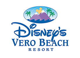
CASE HISTORY
Positioning: “A turn-of-the-century Grand Old Florida Resort experience on The Treasure Coast with all the quality and modern conveniences you’ve come to expect from Disney.”
Creative Platform Directives:
- Message/Concepts: The individual activities and features of the resorts were brought to life in headlines and copy that touched the “child” in the parent. These messages communicated the features with a creative twist, imagination and fun that were unmistakably Disney.
- Logo: Because, at the time, other properties were planned around the world, we created an animated logo incorporating the icon’s geographic features. This artwork was designed to allow the individual properties to be added as they were established.
- Design Directive: The headline message concepts that touted the individual property’s features and experiences were leveraged further with romantic, rich photography. It was real, and real Disney. The ads/brochures, etc. were chock full of original artwork (doubloons, ducks, Indians, ships, etc.) that depicted items found today or found historically at the destinations. This created a Disney imagination twist on real life, fascinating to children and adults. Over 97 images and individual pieces of artwork were created. No stock art was used. If we were to successfully leverage the unique Brand Positioning, no one else could have anything that looked like it.
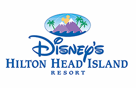
CASE HISTORY
Positioning: “A Low Country experience by Disney and no one does the Low Country like Disney.”
Creative Platform Directives:
- Message/Concepts: The individual activities and features of the resorts were brought to life in headlines and copy that touched the “child” in the parent. These messages communicated the features with a creative twist, imagination and fun that were unmistakably Disney.
- Logo: Because, at the time, other properties were planned around the world, we created an animated logo incorporating the icon’s geographic features. This artwork was designed to allow the individual properties to be added as they were established.
- Design Directive: The headline message concepts that touted the individual property’s features and experiences were leveraged further with romantic, rich photography. It was real, and real Disney. The ads/brochures, etc. were chock full of original artwork (doubloons, ducks, Indians, ships, etc.) that depicted items found today or found historically at the destinations. This created a Disney imagination twist on real life, fascinating to children and adults. Over 97 images and individual pieces of artwork were created. No stock art was used. If we were to successfully leverage the unique Brand Positioning, no one else could have anything that looked like it.
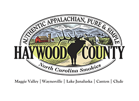
TESTIMONIAL
“I would like to thank the Goss Agency and the Tourism Development Authority Staff and Board for their work in the creation of our new brand and logo. This logo will accentuate the implementation of our long term strategic plan. This plan will be instrumental in guiding us into
the future.”
- Ken Stahl, Haywood County Tourism and Development Authority Chairman
CASE HISTORY
CHALLENGE
The first ever official branding campaign for the 208-year-old county. Haywood County’s 555 square miles has four small towns, none of which had appeal on their own to be a main attraction. When coupled with the other amazing cultural, outdoor, and agritourism experiences, the County had the potential to be the attraction, especially in an age with travelers, especially millennials, seeking “things real.” The Haywood County TDA hired The Goss Agency to execute its branding and marketing plan, which included visitor, stakeholder, and competitive research, brand positioning, logo/tagline, marketing plan, website,
and digital ad campaign.
SOLUTION
Execution of:
- Branding Program
- Logo/Tagline
- Strategic Marketing/Media Plan
- Social Media Strategic Plan
- Highly-targeted display ad campaign designed for each of the nine affinity target profiles to which the diverse Haywood County features applied
- New Mobile Responsive Website
- Visitor’s Guidebook/Collateral
- Monthly Monitoring/Reporting
- Execution of Pinterest’s new “Rich Pin” boards, allowing visitors to do self-guided mobile tours through the Pinterest app
RESULTS
Some highlights from the results of the
Haywood County TDA campaign:
- 154% Web Traffic Increase
- 49% Increase in Traffic to Website from Display Ads
- 36% Increase in Display Ad CTR
- 83% Increase in Twitter Impressions
- 48% Increase in Twitter Followers
- 48% Increase in Instagram Followers
- 89% Increase in YouTube views
- 21% Increase in YouTube subscribers
- 44% Increase in Pinterest Followers
- 20% Increase in Room Nights
TESTIMONIAL
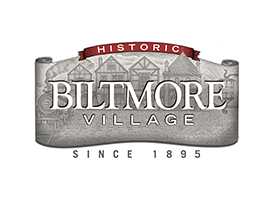
“This brand revitalization has contributed to an average sales increase of about 16%, according to participating merchants, and has breathed new life into the Village, providing the missing and well deserved image of an international quality leisure shopping experience with distinctive independent and national shops, restaurants, and lodging in a relaxed, historic, charming setting.”
- Curtis Williams, Biltmore Property Group
CASE HISTORY
In the late 1800s, Historic Biltmore Village was conceived by visionary millionaire George Vanderbilt and designed by the world-renowned architect Fredrick Law Olmstead as the home to the hundreds of artisans, builders, and craftsmen there for the construction of the Biltmore Estate. Today, the preserved historic village is home to over 80 independent and national shops and restaurants.
With other shopping center developments emerging around Asheville, the traffic and sales were beginning to drop.
The Merchant’s Association hired The Goss Agency to execute the first ever branding and marketing campaign with Brand Logo, tagline, event schedule, website, marketing plan, brochures, and historic map and visitors guide.
RESULT
Average 16% sales increase over the
first year.

Positioning: “The resort for the pampered and well-traveled. Where to go for the pleasures you expect when you’ve seen it all.”
Creative Platform Directives:
- Headline concepts: The distinctive features and benefits of the property were leveraged individually in a manner that appealed to the target’s discriminating taste and ego. The ad featured here was placed in the Yacht Chart Guide for the Caribbean.
- Design Directive: Each ad/communications piece in the campaign displayed a single, large image of a specific feature with a torn edge to suggest a sense of adventure. It was surrounded by smaller shots of all the features and benefits identified as “hot buttons” in our proprietary “Benefits Testing” research. The entire ad was enclosed with a nautical border that conveyed the romance and sophistication of travel and sailing. A single large
primary image.
TESTIMONIAL
“Jeff Goss of The Goss Agency headed the creative image campaign that defined the beautiful qualities of our island. The campaign was defined through identifying what specific island attractions appealed to the various audiences. The attraction-specific ads were strategically placed in related verticals to capture the audience. Islands Magazine was so impressed with the new campaign they gave it preferred placement, inside front cover – a 20-percent premium at no additional cost. Island Tourist Board tracking indicated a 37-percent increase in inquiries.”
- Maria Fowl, Director of Marketing, The Island of St. Lucia
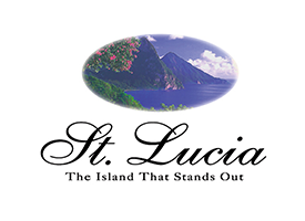
CASE HISTORY
Challenge: The St. Lucia Tourist Board needed to meaningfully differentiate the Island from the many islands in the Eastern Caribbean. The board was leaning toward positioning the Island as “the island with the friendliest people.”
Solution: We conducted Inside Insights© Focus Groups with travelers who had been to the Caribbean at least once and planned to visit again within the next two years. We discovered that these travelers considered “the island with the friendliest people” to be Jamaica. Different attitudinal segments favorably received two Benefit Statements, “The Authentic West Indies” and “The Island Adventure.” Both of these strategic benefits are still incorporated into the current advertising and public relations campaigns.
Results: After one year into the campaign with the new Brand Positioning, island inquiries were up 37% and visitation from the U.S. was up 18%. American Airlines added two additional roundtrip weekly flights from Miami to St. Lucia.
The Island of St. Lucia (St. Lucia, West Indies), Positioning: “Authentic West Indies and Adventure
Island Experience.”
Creative Platform Directives:
- Headline messages/concepts: Messages for print, radio, and all material leverage the distinctive benefits and features (cocoa plantation, walk-in volcano, deep-sea fishing, etc.) in a compelling manner that touches the emotions of the prospect, thus leveraging the
Brand Positioning.
- Design Directive: Colorful border is derived from the rich English, French and African cultures and history. Using a cream colored background reflects the warm spicy feeling of St. Lucia; friendly people, nutmeg, cocoa, vanilla falling from the trees and multicolored sands and beaches. Typefaces: Selections designed to appeal to sophisticated travelers while communicating the adventure aspect of “Authentic West Indies” and “Adventure Island” positioning.
- Logo: Transition from the previous logo icon/mark of the Hibiscus flower to an illustration of the Piton Mountains. One of the most recognizable features in
the Caribbean.
- Positioning Line: “The Island That Stands Out.”
Depending upon media placement and benefit/feature focus of the individual ad or communication, the positioning line, “The Island That Stands Out,” promotes either the “Authentic West Indies” or “Adventure Island” positioning without compromising either one. And very importantly, in an indirect way, the positioning line references one of the most identifiable features in the Caribbean, The Piton Mountains, which happen to be in St. Lucia. This was totally under-represented and under-utilized prior to our Brand
Positioning program.
TESTIMONIAL
“I have found Jeff and the Goss Agency wonderful to work with. He is the consummate professional and always delivers on what he has promised. It is also refreshing to work with someone who genuinely loves his profession and isn't just in it to promote himself or provide substandard deliverables just to make a deal.”
- Anne McCudden, Museum Director, Ah-Tah-Thi-Ki Museum
Native American
TESTIMONIAL
“It was time to consolidate our resources and unite our cultural entities and conduct an RFP for a marketing partner. We narrowed our list of prospects and send out our RFP to a dozen or so marketing agencies in the Southeast. From the moment we looked at the ads done by The Goss Agency it was obvious the “got us”. It was obvious they did their homework and knew something about our culture. Their presentation of our culture was truly striking. We looked proud and accomplish and rich with heritage and tradition in a ‘National Geographic’ sort of way. Since then, 4 years ago, the advertising has instilled a sense of pride in our people and the results have been profound from town levy to numbers at the gates of the Fairgrounds, Drama, Village
and Museum.”
- Mary Jane Ferguson, Director of Marketing, The Eastern Band of Cherokee Indians
CASE HISTORY OF CRISIS
Embarking on the 2010 season, NC Tourism issued a notice reporting the results of a national travel industry survey conducted as a result of alarming gas prices on how the state would be affected from a travel and tourism perspective:
- The good news was that 89% of the people who had planned to travel would still be traveling as planned.
- The bad news was they were planning on cutting their daily spend an average of 75% to cover the added fuel cost.
The Goss Agency acted fast as our goal and focus is our clients’ success. Not to mention, Cherokee’s marketing budget was derived from Tribal Levy, or tax on retail purchases. The agency team gathered in the conference room for a series of ½ day brain storming sessions on how to stem the problem.
SOLUTION
TGA created a pocket-sized map that looked like a passport with the Cherokee Tribal Seal. On one side was a map with all the retail/attractions by category with promotions and special offers, on the other side the historical and cultural brand romance story of the Cherokee.
This piece accomplished 3 things:
- Made people aware of all significant businesses, catering to tourists by category and got people from shop, to restaurant, to hotel, to attraction and so on.
- Told the cultural and historical story of the Cherokee people.
- Efficiently guided people around town with an illustrated map which became a souvenir.
Setting the stage for the launch of the Cherokee Passport to the sovereign nation Cherokee:
In typical TGA fashion we didn’t just issue a press release we released a story. A story with a hook: “Tribal Chief Michel Hicks, announces, “If you are going to the sovereign nation of Cherokee you will now need a passport.”
The Goss Agency with Cherokee Tribal officials created physical road blocks (with Cherokee Police, cones, barriers, flashing arrow highway signs) at the entrances into Cherokee from the Great Smoky Mountain National Park and Hwy. 441. Vehicles entering Cherokee were stopped by the tribe’s Warriors of AniKituhwa dressed in traditional regalia asked them for their “Passports” in the native Cherokee language. After a few moments of “interrogation” and with much laughter, the driver was issued a Cherokee Passport and told to have a good time.
RESULTS
- Cherokee Passport story was on the 5, 6, 11 pm local news.
- Cherokee Passport story was syndicated and picked up by the Associated Press.
- More than 5,000 Cherokee Passports were issued in the first week of the promotion.
- Over the course of the promotion, spending increased by 19% across local businesses, attractions, hoteliers and restaurants.
- Images and video from the roadblock appeared across all social media networks as Cherokee visitors posted photos and updates, tagging Visit Cherokee, to their personal Facebook pages and Twitter accounts.
- The number of Visit Cherokee’s Facebook page fans rose 300% plus during the event and the days following the roadblock.
- Chatter about the passport on the Visit Cherokee’s Facebook page remained high throughout the summer.
- Multiple media outlets and bloggers picked up the Cherokee Passport and Road Block story.
As a result of the ingenuity of the event and the passport, the Asheville Citizen-Times wrote and published an editorial board column commending the Tribe on its creativity and responsible use of casino revenues.
CASE HISTORY
THE CHALLENGE
Renowned 55-year-old outdoor drama, Unto These Hills, tells the story of the removal of the Cherokee, the attendance was down 49%. As well, the Museum of the Cherokee Indians and Oconaluftee Indian Village visitation was down over 40%. Retail sales were off 30% and overnight stays down 23%. A survey showed very little brand awareness and virtually “0” brand recall, outside the association with Harrah’s Casino. In fact the image that did live was negative: “rubber tomahawk; run down; no place to eat; dated; social problems”. Adding to the problem, there were multiple attractions with individual budgets projecting conflicting brand imaging
and messaging.
SOLUTION
Unify Stakeholders: attractions, retail, hotels etc.
- Conduct Past Visitor and Prospect Online Survey identifying target profiles, perceptions and barriers.
- Execute TGA Branding Program: Brand Audit, Competitive Analysis, Psychographic Profile Analysis, Stakeholder and Influencer Interviews, Branding Workshop, Quantitative Study, Focus Groups, Brand Laddering, Brand Positioning Story/Statement, Logo, Branding Themeline, Affinity Target profiling and prioritization, Strategic Marketing/Media Plan, PR plan, Social Media strategy/Plan, resulting in these tactics: Targeting ad campaign all media, outdoor campaign, TV/Radio (Branding and Event), Collateral: Visitor Guides, Rack Brochures, Attraction Brochures, Group Planner/Tour Operator Kit (translated to German), Wayfinding, Tradeshow Booths, Event Campaigns, Websites Destination/Attractions, Passport Program (Visitor’s Map/Heritage Guide
with Promotions).
RESULTS
- 47% Increase in attraction
ticket revenue
- 19% levy increase (retail sales)
- 300% increase in merchandise sales
- 233% Increase in Website Traffic
- 150% increase in Event Revenue
- 280% average Social Media growth across channels
- 85% increase in
International visitation
- 34% increase in Hotel/Cabin/
Campground accommodations
- 230% increase among target profile in Brand Attitude/Awareness
- Stakeholder/brand unification
- Featured partner in NC Tourism Website (previously
no presence)
- $5.5M PR measured value 5 years
TESTIMONIAL
“I have found Jeff and the Goss Agency wonderful to work with. He is the consummate professional and always delivers on what he has promised. It is also refreshing to work with someone who genuinely loves his profession and isn't just in it to promote himself or provide substandard deliverables just to make a deal.”
- Anne McCudden, Museum Director, Ah-Tah-Thi-Ki Museum
Real Estate
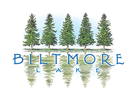
After months of attempting to arrive at a logo for the new residential community Biltmore Lake by Biltmore Farms the marketing director, formerly with Disney, contacted his Disney agency to do the job.
After several more months and an impending launch breathing down their neck, The Goss Agency was contacted and contracted to execute the iconic Biltmore Lake brand mark.
I was invited to tour the undeveloped property. There was a rundown community house and beside it was a lake with a chain link fence around it.
I then observed a row of stately giant majestic balsam fir trees on the edge of the lake. I could not get on the lake, but when I imagined what they must look like reflecting in the mirror like surface of the lake, the logo was born.
After providing several variations in the form of concept sketches, the final was chosen. The type was executed by a typographer in Atlanta, creating their own unique typeface, and the trees were drawn by an illustrator in California.
TESTIMONIAL
“After assembling, purchasing and initiating the development of Cliffs Legacy acquisitions in Chile, Scotland and British Columbia, we needed a marketing approach that was on the level of the vision for the properties. We selected Jeff and his team based in Asheville, N.C., due to their experience and marketing expertise to reach a very finite audience that could pay $250K for a membership. The Goss Agency delivered a concept and positioning strategy that truly was compelling. It was unique in any category while capturing the very essence of what made Cliffs Legacy.”
- Tom Martin, VP of Marketing, Legacy
TESTIMONIALS
“Working with Jeff and his staff was a wonderful and delightful experience.
From concept to execution, every detail was performed in an organized, on time and in a professional manor, and with great inspiration and excitement.
A great listener and advisor, Jeff and his team provided the "juice" to create the idea and vision of our story, which won the prestigious Addy Award and helped us successfully launch a project in difficult economic times.
I would love to work with Jeff on another project in the future. The most qualified leads I’ve ever seen in my 20 years in the business, and the entire sales team shares the same sentiment.”
- Tom Tamrack, Marketing Director, The Thoms Estate
“The best creative piece I’ve ever done … I’m extremely pleased with the results.”
- Kent Smith, CEO, The Thoms Estate
“It is nice to have contacts that actually want to be contacted.”
- Josh Smith, Sales Director, The Thoms Estate
Retail and Consumer Goods
CASE HISTORY
Challenge: Austin is the nation’s largest producer of cracker sandwiches. However, a major part of its distribution has been to club stores and mass merchandisers where its profit margins are low. The company wanted to brand Austin in the supermarket channel where its share of market trails Frito-Lay, Keebler, and Lance.
Solution: Inside Insights© Focus Groups were employed to uncover the “hot buttons” that lead to a consumer purchase. It was discovered that the strongest benefit that motivates consumer use of cracker sandwiches is the benefit of “ending the hungries." The primary reason to choose cracker sandwiches over other snacks is to satisfy hunger cravings until a full meal can be enjoyed.
Results: AQFI launched the first advertising and public relations program in its history in three test markets. On-pack promotions and end-aisle displays touted "End the Hungries." Based on the results, Austin rolled out the program into the 15 markets having the highest proportionate consumption of cracker sandwiches.
Austin Quality Foods (Raleigh, NC), Brand
Positioning: “Satisfies the Hungries.”
Creative Platform Directives:
- Concept/message: Visual and entertaining 30-second TV concept of a mother driving a car with a hungry child in the back seat. The child’s stomach growls and the mother hears it. The camera zooms into the child’s stomach. They’re in a dreamy fantasy sequence with a hungry lion roaming around roaring. Just as the lion is about to pounce, a hunting party with the mother now in the dream as a safari member, offers the lion a cracker sandwich. The camera is back in the car and the child is finishing a cracker with a satisfied look. Concept identifies with the challenges facing a busy mother taking care of the family and sets Austin Cracker sandwiches up as the solution.
- Design Directive: Shot in an adventure movie style. The spot has a warm and fuzzy feel that appeals to the mother while maintaining an edge that satisfies her sense of adventure and assures her that this product will appeal to her children, therefore, fulfilling the promise and leveraging the Brand Positioning
“Satisfies the Hungries.”
Until partnering with The Goss Agency, Baffin Boots of Canada relied heavily on sales and reputation to sustain its growth. While TGA certainly respects and supports this approach, we believe it is imperative to build a brand.
As with most clients we choose to work with, Baffin had the gems of quality and features in its products that could be transformed into messages that identify with the prospect. We developed a print campaign that was designed to tap the passion and build a bond with the extreme-cold-weather sports enthusiast. The campaign continued to increase sales, and ran for a number of years in trade shows and consumer publications.
“A boot designed by 2 guys from the tundra instead of an office park." This is one of the headlines of the campaign and represents why this boot is exceptional and the brand messaging is cutting edge. This was a boot designed for ice fishing and snowmobiling in a wind chill of minus 30 degrees. We developed cutting edge, award-winning lines provoking thought, fear, and identifying with the isolation in this vast no mans’ land. In the execution of the ad, in TGA fashion, we design the concept, not decorate it. We placed the boot small in the middle of a blizzard with a vast open shot of the tundra. The headline, in very small characters, seems to be walking across the jagged mountain range top and reads, “what to look for in a boot where the wrong boot could result in amputation." This design communicated, “nature big, man small, and we are the solution."
TESTIMONIAL
“You and your firm are doing a very good job for us.
The reasons for my comment are:
- You understand what we need as a propane retailer.
- Your work is organized and focused on results, not the work.
- Your people are professional
I’ve worked with a lot of consultants in the career (IT, strategy, HR, marketing) and you are among the best. Feel free to call to discuss further."
- Randall R. Doyle, CFO, Blossman Gas
CASE HISTORY
Challenge: The Chubb Institute, Parsippany NJ, is a division of The Chubb Corporation. Despite the prestigious name, the school was perceived as just another technical/vocational school in the Northeast, Midwest, and Southeast.
Solution: We conducted Benefits Testing Focus Groups with students and applicants who did not attend. The research insights indicated that computer/technical schools were largely ignoring the emotional aspects of the decision to return to school.
We developed a new brand and corporate positioning for Chubb. This encouraged Chubb to move away from its “trainer” brand image and shift to a brand personality of “the encouraging, confident mentor.”
Results: At the time of new Brand Positioning, launch enrollments were off 32% from its recent highest level due to the technology bust. The new Brand Positioning “stopped the bleeding,” increasing enrollments 17%. To this day, The Chubb Institute, as well as the IT industry, has not regained its highest volume as in late 1999.
Even though they had manufactured frozen pies for more than four decades, little was known about the Atlanta-based Edwards Baking Company.To make Edwards stand out in the industry and increase sales, an upscale niche within the frozen dessert category was created.The Edwards Gourmet brand consisted of high-quality, non-traditional flavors that were more likely to be found in a chef’s kitchen than the supermarket freezer aisle.
After the second year of Gourmet’s introduction, total sales for Edwards were up 54 percent. Although intended to be seasonal, Key Lime and Strawberry Mousse became items available all year because of high consumer demand. The new packaging designed for the Gourmet line received the 1995 National Paperboard Packaging Award in the frozen dessert category. Currently, the Gourmet products represent 30 percent of all Edwards’ gross retail revenues. The way to build your business isn’t necessarily an ad. The right agency considers all angles.
 "Add a smile to your day.”
During the 2008 gasoline crisis, The Goss Agency developed and executed a social media promotion for Krispy Kreme to engage the consumer with the brand campaign “Add a smile to your day” by handing out fresh Krispy Kreme donuts in long gas lines. The response videos recorded received over 20,000 hits and shares.
It was in the late ’50s that Speidel bracelets reached their height of popularity among teenagers. As the late ’60s arrived, this American fashion icon dropped in market share. It was in 1988 that Textron,owner of the Speidel brand, had to decide whether to rebrand the bracelets or drop them from production. It was the challenge of the creative group head to fix the problem. Jeff Goss helped reestablish the image of Speidel by initiating research that resulted in moving away from the established creative approach (it’s a nice, statement piece of jewelry). In other words, “It’s your mom’s tennis bracelet but affordable.” Studies showed that teens didn’t want to appear to have expensive jewelry. They had real concerns — the environment, and drinking and driving.
Jeff created a print campaign using very fashionable teen models from top NY agencies, Ford and Elite. Our research directed us to put a 17- to 20-year-old in the message to identify with 12- to 13-year-olds. Carol Weinburger, renowned Paris fashion photographer, was hired to shoot these models in environments representative of these teens’ topical stories. This was the first ad campaign to identify with such teen concerns. After one year of running in Teen, Seventeen, YM, and Sassy, the results were staggering. Pushing production and distribution capabilities, the campaign won a Gold EFFIE award for excellence in sales, which increased 37 percent in one year.
Stamford Town Center had the enormous challenge to reach outside its market. Its sights were set on New York City. Its goal: pull shoppers from the best shopping in the world to their mall, a short train ride away.
Stamford Town Center has a lot of stores that Manhattan doesn’t, believe it or not. Also, New Yorkers don’t like to fight crowds after pushing and shoving just to get to work all week. The “Civilized Shopping”theme line was born. We developed full page ads that ran in the New York Times and colorful transit posters. Mall traffic increased 21 percent six months into the campaign.
Strategy and positioning were not so elusive in this case as were simple and high-impact creative executions. The mall has some of the finest stores from around the world; all that was needed was to tell the story. The campaign was strategically planned for the colder months when Northeasterner had cabin fever.
Before concepting or designing, Jeff Goss used his method of looking at the media and the category, and determining what’s being done and what will stand out. Sometimes, a medium can lead to a concept. The first objective is to get the viewers’ attention. In this case, illustration was ideal. Everyone was using photography. The results of this experimental co-op between the stores and the mall was so successful that stores committed to the upcoming year’s campaign to ensure they were not left out.
CASE HISTORY
The Virgin Islands Telephone Company, located in St.Thomas, United States Virgin Islands, has a very different challenge in marketing.The customer base throughout the Virgin Islands has little choice but to use Vitelco for their phone service. However, there are many problems existing providing consistentquality service to their customers: the humidity causes a lot of static on the lines, calls fail to get through, and because of a strong labor union, establishing phone service can take months. Vitelco, in order to correct this negative image, has an aggressive PR campaign funding children’s programs throughout the community. The solution was to launch a newspaper and TV campaign to communicate the technological progress as well as the positive impact Vitelco was making in the community. Still, the battle wasn’t over.
Realizing the sensitivity and potential of Vitelco being perceived as using the community for commercial gain, a strategic and calculated creative approach was devised to promote Vitelco’s image without a backlash.Working with the actual children of the island, photographing them as they participated in the events sponsored by Vitelco, such as the tennis tournament, a specialized location/people photographer was employed to give the photographs a journalistic look and feel.The campaign was successful in stemming negative comments from the community, as well as the press, as it promotes Vitelco’s image.
TELEVISION SPOTS
The Virgin Islands Telephone Company had been our client for about three years. Our focus had been on print, television, and a public relations campaign, with a concentration on stemming complaints about the quality of service in the US Virgin Islands, as the weather, including the humidity and annual storms, continuously wreaks havoc on above ground lines.
The biggest challenge was keeping the swaying palms, ocean breezes, alluring local rum, and the lapping, turquoise Caribbean from washing my mind out to sea.
Our focused campaign was successful in touting, “Although we’re not perfect, we demonstrated the lengths to which VITELCO will go into the storm for its customer.” The campaign included a very notable television spot, which became known as “live wire,” and featured a dancing phone cord plugging itself into the wall and connecting to the phone service.
The success of the campaign created the opportunity and budget to have some fun. You can imagine breaths being held when the Director of Advertising and Public Relations, Katrina, said “I have some good news and some bad news; the good news is that we want you to do a TV spot for the Super Bowl; the bad news is that we only have a $5,000 budget for the production."
Our approach has always been to come up with a compelling idea within the budget versus trying to do an idea outside of the budget. So here is the spot, a use of animated type to convey the message, and capture the audience, and only spend $5,000.
What a a surprise ending and “feel good” spot for VITELCO! We are proud to say that we have had a spot on the Super Bowl, a feat accomplished by an extremely small percentage of advertising professionals.
The New York Times Magazine ran a special issue on the scotches of the world. It was important for White Horse to have a presence in order to maintain its position as one of the favorite blended scotches. The problem was being placed beside ads in long-running, successful campaigns for other brands.
The benefit of White Horse and what makes it a favorite among scotch drinkers is its peatiness. White Horse is one of the peatiest scotches, because it has stubbornly clung to its ancient traditions, using peat for fuel when other blended distilleries switched to oil. Sales increased and awareness rose among scotch drinkers with a concept that leveraged the benefit of White Horse. The single ad was so successful it evolved into a campaign the following year.
Sports and Outdoor
Until partnering with The Goss Agency, Baffin Boots of Canada relied heavily on sales and reputation to sustain its growth. While TGA certainly respects and supports this approach, we believe it is imperative to build a brand.
As with most clients we choose to work with, Baffin had the gems of quality and features in its products that could be transformed into messages that identify with the prospect. We developed a print campaign that was designed to tap the passion and build a bond with the extreme-cold-weather sports enthusiast. The campaign continued to increase sales, and ran for a number of years in trade shows and consumer publications.
“A boot designed by 2 guys from the tundra instead of an office park." This is one of the headlines of the campaign and represents why this boot is exceptional and the brand messaging is cutting edge. This was a boot designed for ice fishing and snowmobiling in a wind chill of minus 30 degrees. We developed cutting edge, award-winning lines provoking thought, fear, and identifying with the isolation in this vast no mans’ land. In the execution of the ad, in TGA fashion, we design the concept, not decorate it. We placed the boot small in the middle of a blizzard with a vast open shot of the tundra. The headline, in very small characters, seems to be walking across the jagged mountain range top and reads, “what to look for in a boot where the wrong boot could result in amputation." This design communicated, “nature big, man small, and we are the solution."

The Goss Agency's Benefits Testing Program successfully identified who would skydive if motivated. In addition to current skydivers, our campaign was designed to reach the “free spirit” type who takes part in other adventurous sports and activities such as rock climbing, but had never skydived.The campaign took shape with solid sky-blue posters and ads that featured small white type, which was positioned as if it were falling through the sky. Reservation bookings went through the roof, forcing our client to choose between pulling the ads or buying another plane.
Travel and Tourism
 “Jeff and his associates provided our Chamber's Economic Development Department with excellent, unique marketing materials that
added great value to telling the Asheville Buncombe County "story" to prospective business and industry nationally and internationally.”
- Ray Denny, Director of Economic Development, Asheville Chamber
TESTIMONIAL
“We are so pleased to be working with Jeff and his team,” says Susan Phillips, Asheville Regional Airport’s director of marketing and public relations. “They have an excellent reputation and experience that will help reposition Asheville Regional Airport as the airport of choice for Western North Carolina. In a very short period of time (less than three months), the effort exhibited shows their understanding of both the business and community needs, through development and implementation of a creative, thoughtful and compelling campaign which primarily targets our business flyers. Since its inception, the campaign has successfully generated interest, attention and action from our customer base, many of whom are now looking to Asheville for both their business and leisure needs.”
- Susan Phillips, Director of Marketing and Public Relations,
Asheville Regional Airport
Updated results: As of Aug. 8, 2004, traffic has increased a record of 25.8 percent since the initiation of the campaign in June 2003.
Update January 2013: Not sure how long you’ve been working with Jeff and his team, but welcome – and congratulations! Jeff and I go back over 10 years, and I’ve always marveled at some of the incredible talent that he has brought to his team. I know you must love working there! From time-to-time I still look at some of the work that Jeff created when we worked together back at the Asheville Regional Airport. It was a great time, and we accomplished a lot. Jeff and his team brought a wealth of tourism background to the airport industry, and it was great to see
such a wonderful airport truly “take-off” and grow!
TESTIMONIAL
“It was time to consolidate our resources and unite our cultural entities and conduct an RFP for a marketing partner. We narrowed our list of prospects and send out our RFP to a dozen or so marketing agencies in the Southeast. From the moment we looked at the ads done by The Goss Agency it was obvious the “got us”. It was obvious they did their homework and knew something about our culture. Their presentation of our culture was truly striking. We looked proud and accomplish and rich with heritage and tradition in a ‘National Geographic’ sort of way. Since then, 4 years ago, the advertising has instilled a sense of pride in our people and the results have been profound from town levy to numbers at the gates of the Fairgrounds, Drama, Village
and Museum.”
- Mary Jane Ferguson, Director of Marketing, The Eastern Band of Cherokee Indians
CASE HISTORY OF CRISIS
Embarking on the 2010 season, NC Tourism issued a notice reporting the results of a national travel industry survey conducted as a result of alarming gas prices on how the state would be affected from a travel and tourism perspective:
- The good news was that 89% of the people who had planned to travel would still be traveling as planned.
- The bad news was they were planning on cutting their daily spend an average of 75% to cover the added fuel cost.
The Goss Agency acted fast as our goal and focus is our clients’ success. Not to mention, Cherokee’s marketing budget was derived from Tribal Levy, or tax on retail purchases. The agency team gathered in the conference room for a series of ½ day brain storming sessions on how to stem the problem.
SOLUTION
TGA created a pocket-sized map that looked like a passport with the Cherokee Tribal Seal. On one side was a map with all the retail/attractions by category with promotions and special offers, on the other side the historical and cultural brand romance story of the Cherokee.
This piece accomplished 3 things:
- Made people aware of all significant businesses, catering to tourists by category and got people from shop, to restaurant, to hotel, to attraction and so on.
- Told the cultural and historical story of the Cherokee people.
- Efficiently guided people around town with an illustrated map which became a souvenir.
Setting the stage for the launch of the Cherokee Passport to the sovereign nation Cherokee:
In typical TGA fashion we didn’t just issue a press release we released a story. A story with a hook: “Tribal Chief Michel Hicks, announces, “If you are going to the sovereign nation of Cherokee you will now need a passport.”
The Goss Agency with Cherokee Tribal officials created physical road blocks (with Cherokee Police, cones, barriers, flashing arrow highway signs) at the entrances into Cherokee from the Great Smoky Mountain National Park and Hwy. 441. Vehicles entering Cherokee were stopped by the tribe’s Warriors of AniKituhwa dressed in traditional regalia asked them for their “Passports” in the native Cherokee language. After a few moments of “interrogation” and with much laughter, the driver was issued a Cherokee Passport and told to have a good time.
RESULTS
- Cherokee Passport story was on the 5, 6, 11 pm local news.
- Cherokee Passport story was syndicated and picked up by the Associated Press.
- More than 5,000 Cherokee Passports were issued in the first week of the promotion.
- Over the course of the promotion, spending increased by 19% across local businesses, attractions, hoteliers and restaurants.
- Images and video from the roadblock appeared across all social media networks as Cherokee visitors posted photos and updates, tagging Visit Cherokee, to their personal Facebook pages and Twitter accounts.
- The number of Visit Cherokee’s Facebook page fans rose 300% plus during the event and the days following the roadblock.
- Chatter about the passport on the Visit Cherokee’s Facebook page remained high throughout the summer.
- Multiple media outlets and bloggers picked up the Cherokee Passport and Road Block story.
As a result of the ingenuity of the event and the passport, the Asheville Citizen-Times wrote and published an editorial board column commending the Tribe on its creativity and responsible use of casino revenues.
CASE HISTORY
THE CHALLENGE
Renowned 55-year-old outdoor drama, Unto These Hills, tells the story of the removal of the Cherokee, the attendance was down 49%. As well, the Museum of the Cherokee Indians and Oconaluftee Indian Village visitation was down over 40%. Retail sales were off 30% and overnight stays down 23%. A survey showed very little brand awareness and virtually “0” brand recall, outside the association with Harrah’s Casino. In fact the image that did live was negative: “rubber tomahawk; run down; no place to eat; dated; social problems”. Adding to the problem, there were multiple attractions with individual budgets projecting conflicting brand imaging
and messaging.
SOLUTION
Unify Stakeholders: attractions, retail, hotels etc.
- Conduct Past Visitor and Prospect Online Survey identifying target profiles, perceptions and barriers.
- Execute TGA Branding Program: Brand Audit, Competitive Analysis, Psychographic Profile Analysis, Stakeholder and Influencer Interviews, Branding Workshop, Quantitative Study, Focus Groups, Brand Laddering, Brand Positioning Story/Statement, Logo, Branding Themeline, Affinity Target profiling and prioritization, Strategic Marketing/Media Plan, PR plan, Social Media strategy/Plan, resulting in these tactics: Targeting ad campaign all media, outdoor campaign, TV/Radio (Branding and Event), Collateral: Visitor Guides, Rack Brochures, Attraction Brochures, Group Planner/Tour Operator Kit (translated to German), Wayfinding, Tradeshow Booths, Event Campaigns, Websites Destination/Attractions, Passport Program (Visitor’s Map/Heritage Guide
with Promotions).
RESULTS
- 47% Increase in attraction
ticket revenue
- 19% levy increase (retail sales)
- 300% increase in merchandise sales
- 233% Increase in Website Traffic
- 150% increase in Event Revenue
- 280% average Social Media growth across channels
- 85% increase in
International visitation
- 34% increase in Hotel/Cabin/
Campground accommodations
- 230% increase among target profile in Brand Attitude/Awareness
- Stakeholder/brand unification
- Featured partner in NC Tourism Website (previously
no presence)
- $5.5M PR measured value 5 years
TESTIMONIAL
“I worked directly with Jeff Goss in the launching of The Disney Vacation Club, which consisted of Disney's Vero Beach Resort and Disney's Hilton Head Island Resort. It was the first time Disney had extended its brand beyond The Walt Disney World Resorts. After eight months of disappointing results in pre-occupation sales, the recommendation spearheaded by Jeff Goss to implement consumer insight programs in the north and in our Florida markets was executed. The insights led to targeted creative that leveraged the unique distinctive characteristics of the properties Disney is known for. It is a Disney policy not to give specific results. I will say the campaign far exceed expectations. Thanks, Jeff.”
- Pat Quinn, Director of Marketing, DVC
CHALLENGE
Disney launched a new brand extension, Disney Vacation Club, to become a network of resorts located throughout the U.S. Today, Disney Vacation Club has resorts in Hilton Head, in Vero Beach, and at Walt Disney World. These resorts represent the first time Disney has moved beyond the boundaries of its theme parks. There was a major challenge with the launch of this brand extension. Disney was known for its fabulous Disney World and animation, but people didn’t know what to expect from Disney in this new venture.
A Disney Vacation Club membership offers use of all the Disney Vacation Club resorts, plus access to many great member getaways such as worldwide resort exchanges, bed and breakfasts, and adventure travel cruises. Disney Vacation Club also offers these individual resorts for rental.
SOLUTION
Jeff Goss spearheaded the creative challenge, establishing the brand extension for Disney Vacation Club as well as creating a brand image based on the cultural distinction of each individual resort. The resulting look was unique to each property, romancing the unique qualities of each location and environment yet leveraging the strength of the Disney name and the company’s many positive qualities. A unique logo, look, and messaging clearly communicated the character of these resorts.
RESULTS
Rental room nights and income exceeded all forecasts.
CASE HISTORY
Positioning: “A turn-of-the-century Grand Old Florida Resort experience on The Treasure Coast with all the quality and modern conveniences you’ve come to expect from Disney.”
Creative Platform Directives:
- Message/Concepts: The individual activities and features of the resorts were brought to life in headlines and copy that touched the “child” in the parent. These messages communicated the features with a creative twist, imagination and fun that were unmistakably Disney.
- Logo: Because, at the time, other properties were planned around the world, we created an animated logo incorporating the icon’s geographic features. This artwork was designed to allow the individual properties to be added as they were established.
- Design Directive: The headline message concepts that touted the individual property’s features and experiences were leveraged further with romantic, rich photography. It was real, and real Disney. The ads/brochures, etc. were chock full of original artwork (doubloons, ducks, Indians, ships, etc.) that depicted items found today or found historically at the destinations. This created a Disney imagination twist on real life, fascinating to children and adults. Over 97 images and individual pieces of artwork were created. No stock art was used. If we were to successfully leverage the unique Brand Positioning, no one else could have anything that looked like it.
CASE HISTORY
Positioning: “A Low Country experience by Disney and no one does the Low Country like Disney.”
Creative Platform Directives:
- Message/Concepts: The individual activities and features of the resorts were brought to life in headlines and copy that touched the “child” in the parent. These messages communicated the features with a creative twist, imagination and fun that were unmistakably Disney.
- Logo: Because, at the time, other properties were planned around the world, we created an animated logo incorporating the icon’s geographic features. This artwork was designed to allow the individual properties to be added as they were established.
- Design Directive: The headline message concepts that touted the individual property’s features and experiences were leveraged further with romantic, rich photography. It was real, and real Disney. The ads/brochures, etc. were chock full of original artwork (doubloons, ducks, Indians, ships, etc.) that depicted items found today or found historically at the destinations. This created a Disney imagination twist on real life, fascinating to children and adults. Over 97 images and individual pieces of artwork were created. No stock art was used. If we were to successfully leverage the unique Brand Positioning, no one else could have anything that looked like it.
TESTIMONIAL
“I would like to thank the Goss Agency and the Tourism Development Authority Staff and Board for their work in the creation of our new brand and logo. This logo will accentuate the implementation of our long term strategic plan. This plan will be instrumental in guiding us into
the future.”
- Ken Stahl, Haywood County Tourism and Development Authority Chairman
CASE HISTORY
CHALLENGE
The first ever official branding campaign for the 208-year-old county. Haywood County’s 555 square miles has four small towns, none of which had appeal on their own to be a main attraction. When coupled with the other amazing cultural, outdoor, and agritourism experiences, the County had the potential to be the attraction, especially in an age with travelers, especially millennials, seeking “things real.” The Haywood County TDA hired The Goss Agency to execute its branding and marketing plan, which included visitor, stakeholder, and competitive research, brand positioning, logo/tagline, marketing plan, website,
and digital ad campaign.
SOLUTION
Execution of:
- Branding Program
- Logo/Tagline
- Strategic Marketing/Media Plan
- Social Media Strategic Plan
- Highly-targeted display ad campaign designed for each of the nine affinity target profiles to which the diverse Haywood County features applied
- New Mobile Responsive Website
- Visitor’s Guidebook/Collateral
- Monthly Monitoring/Reporting
- Execution of Pinterest’s new “Rich Pin” boards, allowing visitors to do self-guided mobile tours through the Pinterest app
RESULTS
Some highlights from the results of the
Haywood County TDA campaign:
- 154% Web Traffic Increase
- 49% Increase in Traffic to Website from Display Ads
- 36% Increase in Display Ad CTR
- 83% Increase in Twitter Impressions
- 48% Increase in Twitter Followers
- 48% Increase in Instagram Followers
- 89% Increase in YouTube views
- 21% Increase in YouTube subscribers
- 44% Increase in Pinterest Followers
- 20% Increase in Room Nights
TESTIMONIAL
“This brand revitalization has contributed to an average sales increase of about 16%, according to participating merchants, and has breathed new life into the Village, providing the missing and well deserved image of an international quality leisure shopping experience with distinctive independent and national shops, restaurants, and lodging in a relaxed, historic, charming setting.”
- Curtis Williams, Biltmore Property Group
CASE HISTORY
In the late 1800s, Historic Biltmore Village was conceived by visionary millionaire George Vanderbilt and designed by the world-renowned architect Fredrick Law Olmstead as the home to the hundreds of artisans, builders, and craftsmen there for the construction of the Biltmore Estate. Today, the preserved historic village is home to over 80 independent and national shops and restaurants.
With other shopping center developments emerging around Asheville, the traffic and sales were beginning to drop.
The Merchant’s Association hired The Goss Agency to execute the first ever branding and marketing campaign with Brand Logo, tagline, event schedule, website, marketing plan, brochures, and historic map and visitors guide.
RESULT
Average 16% sales increase over the
first year.
The Goss Agency's Benefits Testing Program successfully identified who would skydive if motivated. In addition to current skydivers, our campaign was designed to reach the “free spirit” type who takes part in other adventurous sports and activities such as rock climbing, but had never skydived.The campaign took shape with solid sky-blue posters and ads that featured small white type, which was positioned as if it were falling through the sky. Reservation bookings went through the roof, forcing our client to choose between pulling the ads or buying another plane.
Positioning: “The resort for the pampered and well-traveled. Where to go for the pleasures you expect when you’ve seen it all.”
Creative Platform Directives:
- Headline concepts: The distinctive features and benefits of the property were leveraged individually in a manner that appealed to the target’s discriminating taste and ego. The ad featured here was placed in the Yacht Chart Guide for the Caribbean.
- Design Directive: Each ad/communications piece in the campaign displayed a single, large image of a specific feature with a torn edge to suggest a sense of adventure. It was surrounded by smaller shots of all the features and benefits identified as “hot buttons” in our proprietary “Benefits Testing” research. The entire ad was enclosed with a nautical border that conveyed the romance and sophistication of travel and sailing. A single large
primary image.
TESTIMONIAL
“Jeff Goss of The Goss Agency headed the creative image campaign that defined the beautiful qualities of our island. The campaign was defined through identifying what specific island attractions appealed to the various audiences. The attraction-specific ads were strategically placed in related verticals to capture the audience. Islands Magazine was so impressed with the new campaign they gave it preferred placement, inside front cover – a 20-percent premium at no additional cost. Island Tourist Board tracking indicated a 37-percent increase in inquiries.”
- Maria Fowl, Director of Marketing, The Island of St. Lucia
CASE HISTORY
Challenge: The St. Lucia Tourist Board needed to meaningfully differentiate the Island from the many islands in the Eastern Caribbean. The board was leaning toward positioning the Island as “the island with the friendliest people.”
Solution: We conducted Inside Insights© Focus Groups with travelers who had been to the Caribbean at least once and planned to visit again within the next two years. We discovered that these travelers considered “the island with the friendliest people” to be Jamaica. Different attitudinal segments favorably received two Benefit Statements, “The Authentic West Indies” and “The Island Adventure.” Both of these strategic benefits are still incorporated into the current advertising and public relations campaigns.
Results: After one year into the campaign with the new Brand Positioning, island inquiries were up 37% and visitation from the U.S. was up 18%. American Airlines added two additional roundtrip weekly flights from Miami to St. Lucia.
The Island of St. Lucia (St. Lucia, West Indies), Positioning: “Authentic West Indies and Adventure
Island Experience.”
Creative Platform Directives:
- Headline messages/concepts: Messages for print, radio, and all material leverage the distinctive benefits and features (cocoa plantation, walk-in volcano, deep-sea fishing, etc.) in a compelling manner that touches the emotions of the prospect, thus leveraging the
Brand Positioning.
- Design Directive: Colorful border is derived from the rich English, French and African cultures and history. Using a cream colored background reflects the warm spicy feeling of St. Lucia; friendly people, nutmeg, cocoa, vanilla falling from the trees and multicolored sands and beaches. Typefaces: Selections designed to appeal to sophisticated travelers while communicating the adventure aspect of “Authentic West Indies” and “Adventure Island” positioning.
- Logo: Transition from the previous logo icon/mark of the Hibiscus flower to an illustration of the Piton Mountains. One of the most recognizable features in
the Caribbean.
- Positioning Line: “The Island That Stands Out.”
Depending upon media placement and benefit/feature focus of the individual ad or communication, the positioning line, “The Island That Stands Out,” promotes either the “Authentic West Indies” or “Adventure Island” positioning without compromising either one. And very importantly, in an indirect way, the positioning line references one of the most identifiable features in the Caribbean, The Piton Mountains, which happen to be in St. Lucia. This was totally under-represented and under-utilized prior to our Brand
Positioning program.
TESTIMONIAL
“I have found Jeff and the Goss Agency wonderful to work with. He is the consummate professional and always delivers on what he has promised. It is also refreshing to work with someone who genuinely loves his profession and isn't just in it to promote himself or provide substandard deliverables just to make a deal.”
- Anne McCudden, Museum Director, Ah-Tah-Thi-Ki Museum
Business to Business
CASE HISTORY
By compiling data and available research, some conducted by the industry and some by Amoco over the decades, we repackaged and presented this information on their website and collateral in an informative and educational manner technically helpful in executing and specifying a project for civil engineers. Thus, Amoco Fabrics and Fibers was established as the authority in geo-textiles and it was a risk to do a job without their knowledge. This positioning was carried out in direct mail and ads in industry publications that struck the emotions surrounding the risk.
Positioning: “The superior engineered wire, freeing you from time, worry and concerns surrounding fencing and repair.”
Creative Platform Directives:
- Headline/concept messages: The messages identified with the rancher’s and farmer’s emotions leveraging the strengths/benefits of the wire with intelligent, humorous thoughts that animals might have when fenced in with Bekaert wire.
- Design Directive, steely blue photography: Images were shot to promote the cold, hard, tough nature and construction of the wire. We wanted to say steel and blue not only did it; but it stood out in publications among the competition’s more expensive predictable 4- color images. Typeface: We used a powerful, no-nonsense san serif headline face to promote strength and control. The headline was reversed out of the duotone bleed images in a size that did not compete with the image.
- Logo: We crafted individual Brand logos for the Bekaert product lines. For the field fence and barbed wire we created the name “Gaucho” and crafted a trademark to resemble a branding iron mark, a symbol of the old West for containing cattle. It was especially effective since our research revealed that our targeted traditional ranchers perceived Bekaert’s higher tensile strength steel wire as weaker because it was smaller.
- Positioning Line: “The Superior Wire, There’s No Escaping It.” This line captured the spirit of the ranchers and the old West by displaying guts and confidence.
There was an unmet need for a paper chemicals manufacturer who appeared friendly and less “chemical.” We helped Eka Nobel take the position of owning products that allow smoother operation and less downtime, requiring less maintenance and offering better performance.
Empathizing with the customers’ pressures and concerns, we positioned Eka Nobel as the leader in the category through ads and posters for the plant break rooms and offices.
TESTIMONIAL
“The new corporate identity, clear and focused message, and the branding that you created for us have been very helpful and powerful for us. We have seen that we now attract more interest in the marketplace and that we have increased credibility.Furthermore, the message is clear enough that we have been attracting the kind of clients we desire most and not just raw numbers.”Your work has allowed us to generate a more dynamic, techy, and partner-like image in the global marketplace. I feel that the increased international interest, inquiries, and business we have seen are a result of this marketing program. The web site you designed is unique, very effective and well received. The branding, identity, web site, and sales materials affect the way the world perceives us. I have definitely seen increased market interest and confidence, which will help generate and assure our future success.”
- Neil Farnam, CEO, Farnam Custom Products
CASE HISTORY
Challenge: Farnam Custom Products in Arden, NC, is a customizer of industrial products — a niche player that sells special products/parts that can be significantly modified.Farnam needed to move more towards higher-volume products while not giving up its “customizer” niche. Was it possible to do so without giving up its point-of-difference as the “ultimate customizer”?
Solution: Interviews with Farnam’s customers uncovered its marketplace strengths:
Position Farnam as the cost-effective solutions provider offering.
We recommended that Farnam continue its role as “ultimate customizer” while inching towards more standard applications, as long as these applications allowed and encouraged liberal modifications.
- Results: Eighteen months into new Brand Positioning, sales were up 25%, attracting international acquisition opportunity. Advertising was placed on hold to catch up to
back logged orders. - Headline/messages: Messages/concepts were written to leverage the custom solution that Farnam offers and elevate the distinctive Brand positioning. Messages/Headlines promote the features and benefits of the Farnam Custom Solution in a way that touches the emotions of the prospect by appealing to the intelligence and fear of the target by raising the risks of making the wrong decision as compared to the better results of a custom solution.
- Design Directive: Cream PMS background denotes warmth for the nature of the product and the company employees from the top down. Graphics: Colors and design denote energy, complexity, depth, heat, and the use of technology to arrive at the best custom solution.
- Logo: Bold san-serif “F” is simple, powerful and memorable, leveraging leadership positioning. The combination of orange and red create the effect that the logo is glowing hot.
- Positioning Line: “A higher degree of performance” elevates the Farnam Custom Solution as the best solution with a message of no compromise when it comes to your business and career, thus leveraging the strengths and benefits and supporting the newfound position of Farnam Custom Products.
Preceding deregulation that allowed Georgia Power customers to choose power companies throughout the Southeast, Georgia Power decided on a preemptive strike. Even though solid relationships had been established, there was still concern about some defection.
After a thorough customer study, it was decided to take the high road and remind customers of the support and resources lent by Georgia Power day-to-day and especially in a crisis. Actual examples were used for a series of ads placed in the Wall Street Journal. The portraits of the Georgia Power Representatives were etched in the same style and by the same illustrator of the Wall Street Journal, giving the campaign stature and credibility.
TESTIMONIAL
“In the category of international food brokerage, we were facing competition focused on one category of food with budgets triple ours while our budget was to be spread over four categories. We needed a lean, experienced, superman agency. A director of marketing who are a close friend and associate recommended the Goss Agency to me. After a search and review of four agencies, our team of eight unanimously elected to work with Jeff Goss at The Goss Agency.
“Jeff’s team wrote our marketing plan and media strategy. With a combination of outstanding creative and media strategy, they showed us a way to increase our customer base of buyers and sellers 18 percent in six months. They changed the way the most dominant magazine in the restaurant category sold its ads in order to accommodate our unique buy. We executed a schedule of small space ads in the Wall Street Journal targeting the C level of the food industry on the commodities page, creating sell-in from the top as we targeted buyers and sellers, never done before.”
- Karen Fox, Director of Marketing, Global Food Exchange
CASE HISTORY
With The Goss Agency, Global Food Exchange.com avoided the “.com” negative profiling before it was even known to be a negative. Objectives and sales goals were established. Senior marketing at TGA extensively interviewed Global Food Exchange’s management, marketing and sales teams and reviewed the food trade industry from a traditional and web technology perspective.
From this exercise, it was determined there were two distinctively different targets (CEOs of the big food companies and buyers/sellers of the individual food categories).Two separate strategies and media approaches were required to complete the sales cycle and reach goals.
Brand positioning was defined on expertise, not the technology to implement it. From this positioning, a series of six ads were designed to create a monologue with the buyers/sellers of all categories of food, addressing their identified concerns and needs.
Publications were evaluated. An innovative media strategy was created that not only changed the way Super Market News sold ads, but established reach and frequency above competition who were spending four times as much as Global Food Exchange and only focused on one category. A small-space campaign was designed for the Wall Street Journal to reach the CEOs of the food industry on the commodities page, a tactic never done before.
TESTIMONIAL
“We selected The Goss Agency to spearhead the Massey Ferguson re-branding assignment because of the agency’s ability to conduct the necessary research that helped us position the brand correctly and to create an exceptional creative product. The new Massey Ferguson campaign is among the best in the agricultural industry, and I'm confident that it will deliver against the objective of creating a new image for one of our most important brands.”
- Doug Durand, Manager, Marketing Communication, North America, AGCO Corporation, Massey Ferguson
CASE HISTORY
Challenge: Due to declining sales for Massey Ferguson tractors, AGCO was strongly considering merging this long-established brand into its new line of AGCO agricultural tractors. A proposal had already been made to start this process by changing the color of the Massey Ferguson from red to orange. Was there any Massey Ferguson heritage left worth leveraging in a market so dominated by John Deere?
Solution: Three hundred phone interviews were conducted with farmers in 26 states and were followed up with Inside Insights© Focus Groups. Massey Ferguson Heartland discovered that the Massey Ferguson brand still had a heritage for quality among farmers over age 40.
The brand positioning became: Position Massey Ferguson as the pinnacle of reliability – reliable products and reliable people from a reliable company with a coveted heritage. Focus this reliability on the benefits of “consistent performance” and “long-lasting dependability.”
Results: We discovered that it was detrimental to sales to describe the tractor as “rugged and long-lasting,” which was a previous theme for the brand. One year after the incorporation of the new Brand Positioning, Massey Ferguson Equipment sales were up 9% and Brand awareness up 31%.
AGCO, Massey Ferguson Tractors and Equipment (Norcross, GA), Positioning: “The pinnacle of reliability on the farm. You can depend on your Massey Ferguson.”
Creative Platform Directives:
- Headline concepts: Headlines identify emotionally with the prospect’s needs and concerns while leveraging the Massey Ferguson Tractors, Equipment and Dealers positioning, “What to depend on when everything depends on you.”
- Design Directive, Border: Rich, full-color, bleed, warm, orange and red images of farm scenery identifies with farmer’s lifestyle. Colors are directly connected to product leveraging the Massey Ferguson colors, verses competition. The images are stylized, creating the mood and feeling of the responsibility and demand of life on the farm. Graphics: The three-triangle graphic from the Massey Ferguson logo is utilized for “Brand Awareness,” large in the ad’s negative space incorporating sepia tone images of the dealer, farmer, and equipment. The sepia toned images reflect the heritage and values of the farm, tying Massey Ferguson to heritage, pride and values of the farm. Typefaces and sizes: A small, bold, san serif Helvetica type was chosen for the headline concept messages. This type communicates our concept message headlines in a confident, yet non-arrogant manner. Research clearly indicated that farmers don’t want to be sold. They want to be related to, and supported. They trust their neighbor and usually purchase on recommendation. Thus, the body copy is written in an atypical, non-commercial style with loose, flowing lines, staggered to read as one might talk to you. Logo: Our “Benefits Testing” revealed the dealer and service was as important as the tractor equipment. We underlined the logo with “Equipment and Certified Dealers,” thus combining and branding Massey Ferguson with its dealers and service.
- Positioning Line: “What to depend on when everything depends on you” empathizes with our target that has told us they have a terrific responsibility and pressure and no one to share it with. We put something under them to offer support. The Massey Ferguson tractor.
TESTIMONIAL
“After an agency review of notable advertising agencies for effective creative and brand positioning, we hired Jeff Goss of The Goss Agency to execute our brand message in advertising and trade show graphics materials. The campaign was instrumental in assisting us in bringing CNN on board as a marketing partner.”“At the Javitz Center in New York, the trades show graphics were designed to leverage our unique offering. Our goal for the show, with seven salespeople on the show floor, was 300 new contacts. The outcome from the advertising campaign prior to the show and the show itself was 475. We consider it a success. We highly recommend The Goss Agency for positioning and creative that defines your brand and leads to results.”
- Joe Michael, CEO, Nexchange Corporation
CASE HISTORY
Founded in 1996, Nexchange Corporation is changing affiliate marketing by connecting buyers and sellers on a network of over 75,000 online stores. Using Nexchange’s patent-pending technology, Web site owners open retail stores within the relevant content of their sites -- generating revenue without ever losing their visitors. Retailers include Proflowers, Ashford.com (Nasdaq:ASFD), and Just For Feet among others.Upon completion of consumer insights analysis, the position was identified for Nexchange to take leadership in enabling on-line retail without losing the customer. Also it was determined that what was most important was to communicate this key benefit in simple, uncomplicated term. A series of ads and direct mail were created. Rather than inform the prospect that they could keep the visitor to their site from leaving, the direction was determined to communicate our limitations, where we could not keep them from going, the restroom.
After a thorough review of the industry and customer insights, it was clear that no one fowl processing manufacturer had taken the throne as the premier provider of service and quality equipment, even though the efficiency of the equipment was directly associated with production and, ultimately, the success of the customer’s business and the plant manager’s job security.
Stork, with the graphic look of a Swedish sports car, claimed this positioning for itself. Messages touting the company’s expertise and appealing to the emotions and concerns of the plant managers were developed and placed in direct mail and industry publications.
TESTIMONIAL
“After analysis of our customer research, the creative and strategic team lead by Jeff Goss at The Goss Agency was able to capture the essence of our company, what we do and how we are distinctive like it hasn't been done in our 23 year history. We are always preaching to our clients to let the pros (us) do the research to avoid bias and corporate prejudices. We decided to hire an agency, for the first time, and practice what we preach. The look, feel and concept messages in the ads are dead on. They don't just capture what we do but they give you a reason to come to The Marketing Workshop versus others. The positioning campaign has worked. We are so confident in The Goss Agency’s effectiveness we have, on a regular basis, referred our cherished clients to them.”
- Jim Nelems, CEO, The Marketing Workshop
CASE HISTORY
Marketing Workshop, the Southeastern U.S.’s premier research house had a desire to develop more awareness and importance for ongoing research among corporations and marketing companies throughout the Southeast. Upon completion of customer and prospect analysis, it was identified that an approach that touched the emotions of success and risk aversion was the key message. A series of single color ads with powerful headline messages were created to touch the emotions of those making decisions on marketing efforts and budget expenditures. Ad messages appealed to the conservative nature, sense of humor, risk aversion, and egos of the target, e.g., “Where CEOs turn for advice, other than their spouses.”
After conducting the consumer insights Benefits Testing Focus Group program, we understood the customer identified with the complexity and impractically of managing the PeopleSoft software.
UPS’s objective was to target business. After the Customer Insights Study, a common theme emerged, “shipping was critical to the business but there was something else in the workplace equally critical to the individual and his/her performance - coffee.”
A direct mail campaign was developed to offer a free pound of coffee with your first corporate account shipment. The message: “Two things business can’t live without.”
TESTIMONIALS
“We hired Jeff Goss of The Goss Agency when we were Colvin Aviation based in Athens, Georgia. They implemented their consumer insights program with existing customers and prospects, and executed internal research. The information was invaluable, resulting in Colvin Aviation changing its name to US Jets, changing our category of business focus, and implementing internal communications and employee retention programs.”
“I can't tell you specifically what the work from the team at The Goss Agency has done for our business because it has been so broad. I will mention that the advertising and promotional materials increased our business in cargo, where we were weakest, by 40 percent in six months. After presenting the dynamic closing brochure to our first new customer in Chicago, his comment was, ‘I thought you guys were a crop duster in South Georgia.’ This meeting resulted in a signed $250,000 contract on the spot, which was only the beginning.”
- John Colvin, CEO, US Jets
CASE HISTORY
Underwent internal and external stakeholder interviews and customer satisfaction/key benefits testing. A positioning of “perfection in the air” supported by “standards beyond what are required by the federal government” was identified and articulated in a branding theme line “above and beyond.” The brand look was created to establish “cutting edge and performance.” It was determined that all the areas of customers wanted to feel like they were the only customer and that US Jets was the expert in that area. Therefore, separate advertising, website sections, and brochures were created to focus exclusively on the specific area of business. All graphics for the jets and throughout the company and industry, uniforms, etc., were created to leverage the brand image.
CASE HISTORY
The Virgin Islands Telephone Company, located in St.Thomas, United States Virgin Islands, has a very different challenge in marketing.The customer base throughout the Virgin Islands has little choice but to use Vitelco for their phone service. However, there are many problems existing providing consistentquality service to their customers: the humidity causes a lot of static on the lines, calls fail to get through, and because of a strong labor union, establishing phone service can take months. Vitelco, in order to correct this negative image, has an aggressive PR campaign funding children’s programs throughout the community. The solution was to launch a newspaper and TV campaign to communicate the technological progress as well as the positive impact Vitelco was making in the community. Still, the battle wasn’t over.
Realizing the sensitivity and potential of Vitelco being perceived as using the community for commercial gain, a strategic and calculated creative approach was devised to promote Vitelco’s image without a backlash.Working with the actual children of the island, photographing them as they participated in the events sponsored by Vitelco, such as the tennis tournament, a specialized location/people photographer was employed to give the photographs a journalistic look and feel.The campaign was successful in stemming negative comments from the community, as well as the press, as it promotes Vitelco’s image.
TELEVISION SPOTS
The Virgin Islands Telephone Company had been our client for about three years. Our focus had been on print, television, and a public relations campaign, with a concentration on stemming complaints about the quality of service in the US Virgin Islands, as the weather, including the humidity and annual storms, continuously wreaks havoc on above ground lines.
The biggest challenge was keeping the swaying palms, ocean breezes, alluring local rum, and the lapping, turquoise Caribbean from washing my mind out to sea.
Our focused campaign was successful in touting, “Although we’re not perfect, we demonstrated the lengths to which VITELCO will go into the storm for its customer.” The campaign included a very notable television spot, which became known as “live wire,” and featured a dancing phone cord plugging itself into the wall and connecting to the phone service.
The success of the campaign created the opportunity and budget to have some fun. You can imagine breaths being held when the Director of Advertising and Public Relations, Katrina, said “I have some good news and some bad news; the good news is that we want you to do a TV spot for the Super Bowl; the bad news is that we only have a $5,000 budget for the production."
Our approach has always been to come up with a compelling idea within the budget versus trying to do an idea outside of the budget. So here is the spot, a use of animated type to convey the message, and capture the audience, and only spend $5,000.
What a a surprise ending and “feel good” spot for VITELCO! We are proud to say that we have had a spot on the Super Bowl, a feat accomplished by an extremely small percentage of advertising professionals.
TESTIMONIALS
“Jeff Goss of The Goss Agency defined the look and messaging of the world's first online bank, WebTone. The team at the agency helped us overcome the enormous obstacle of cold technology handling your banking transactions versus human beings. Research established that the average bank customer was already dissatisfied with their bank's service. Customers were open to more effective means to handle their banking needs, especially the computer generation. The campaign ‘Who ever thought it would be technology that would restore customer service to the level it used to be?’ was born.
“After running the campaign, the cost per lead of new bank customers dropped a measurable 19 percent. WebTone Technologies went into the new quarter showing the board an 11.6-percent profit increase in the third and fourth quarters.”
- Brian Hankin,
Marketing Director, Webtone
CASE HISTORY
Conceived by Securities First Bank, Webtone was the world’s first Internet bank for consumers. Martin/Goss was contracted to take the very complicated and intimidating technology story to other banks who could take advantage of this technology without taking the time and expense to develop it. The first step was to refine the positioning, logo, and website. A delicate balance between simple and super-smart technology was forged.This image and awareness was further established in a full-page, four-color ad campaign for IT banking and financial news publications. Trade show graphics, messages, and direct marketing were produced to create the leadership position.
Cultural Tourism
TESTIMONIAL
“It was time to consolidate our resources and unite our cultural entities and conduct an RFP for a marketing partner. We narrowed our list of prospects and send out our RFP to a dozen or so marketing agencies in the Southeast. From the moment we looked at the ads done by The Goss Agency it was obvious the “got us”. It was obvious they did their homework and knew something about our culture. Their presentation of our culture was truly striking. We looked proud and accomplish and rich with heritage and tradition in a ‘National Geographic’ sort of way. Since then, 4 years ago, the advertising has instilled a sense of pride in our people and the results have been profound from town levy to numbers at the gates of the Fairgrounds, Drama, Village
and Museum.”
- Mary Jane Ferguson, Director of Marketing, The Eastern Band of Cherokee Indians
CASE HISTORY OF CRISIS
Embarking on the 2010 season, NC Tourism issued a notice reporting the results of a national travel industry survey conducted as a result of alarming gas prices on how the state would be affected from a travel and tourism perspective:
- The good news was that 89% of the people who had planned to travel would still be traveling as planned.
- The bad news was they were planning on cutting their daily spend an average of 75% to cover the added fuel cost.
The Goss Agency acted fast as our goal and focus is our clients’ success. Not to mention, Cherokee’s marketing budget was derived from Tribal Levy, or tax on retail purchases. The agency team gathered in the conference room for a series of ½ day brain storming sessions on how to stem the problem.
SOLUTION
TGA created a pocket-sized map that looked like a passport with the Cherokee Tribal Seal. On one side was a map with all the retail/attractions by category with promotions and special offers, on the other side the historical and cultural brand romance story of the Cherokee.
This piece accomplished 3 things:
- Made people aware of all significant businesses, catering to tourists by category and got people from shop, to restaurant, to hotel, to attraction and so on.
- Told the cultural and historical story of the Cherokee people.
- Efficiently guided people around town with an illustrated map which became a souvenir.
Setting the stage for the launch of the Cherokee Passport to the sovereign nation Cherokee:
In typical TGA fashion we didn’t just issue a press release we released a story. A story with a hook: “Tribal Chief Michel Hicks, announces, “If you are going to the sovereign nation of Cherokee you will now need a passport.”
The Goss Agency with Cherokee Tribal officials created physical road blocks (with Cherokee Police, cones, barriers, flashing arrow highway signs) at the entrances into Cherokee from the Great Smoky Mountain National Park and Hwy. 441. Vehicles entering Cherokee were stopped by the tribe’s Warriors of AniKituhwa dressed in traditional regalia asked them for their “Passports” in the native Cherokee language. After a few moments of “interrogation” and with much laughter, the driver was issued a Cherokee Passport and told to have a good time.
RESULTS
- Cherokee Passport story was on the 5, 6, 11 pm local news.
- Cherokee Passport story was syndicated and picked up by the Associated Press.
- More than 5,000 Cherokee Passports were issued in the first week of the promotion.
- Over the course of the promotion, spending increased by 19% across local businesses, attractions, hoteliers and restaurants.
- Images and video from the roadblock appeared across all social media networks as Cherokee visitors posted photos and updates, tagging Visit Cherokee, to their personal Facebook pages and Twitter accounts.
- The number of Visit Cherokee’s Facebook page fans rose 300% plus during the event and the days following the roadblock.
- Chatter about the passport on the Visit Cherokee’s Facebook page remained high throughout the summer.
- Multiple media outlets and bloggers picked up the Cherokee Passport and Road Block story.
As a result of the ingenuity of the event and the passport, the Asheville Citizen-Times wrote and published an editorial board column commending the Tribe on its creativity and responsible use of casino revenues.
CASE HISTORY
THE CHALLENGE
Renowned 55-year-old outdoor drama, Unto These Hills, tells the story of the removal of the Cherokee, the attendance was down 49%. As well, the Museum of the Cherokee Indians and Oconaluftee Indian Village visitation was down over 40%. Retail sales were off 30% and overnight stays down 23%. A survey showed very little brand awareness and virtually “0” brand recall, outside the association with Harrah’s Casino. In fact the image that did live was negative: “rubber tomahawk; run down; no place to eat; dated; social problems”. Adding to the problem, there were multiple attractions with individual budgets projecting conflicting brand imaging
and messaging.
SOLUTION
Unify Stakeholders: attractions, retail, hotels etc.
- Conduct Past Visitor and Prospect Online Survey identifying target profiles, perceptions and barriers.
- Execute TGA Branding Program: Brand Audit, Competitive Analysis, Psychographic Profile Analysis, Stakeholder and Influencer Interviews, Branding Workshop, Quantitative Study, Focus Groups, Brand Laddering, Brand Positioning Story/Statement, Logo, Branding Themeline, Affinity Target profiling and prioritization, Strategic Marketing/Media Plan, PR plan, Social Media strategy/Plan, resulting in these tactics: Targeting ad campaign all media, outdoor campaign, TV/Radio (Branding and Event), Collateral: Visitor Guides, Rack Brochures, Attraction Brochures, Group Planner/Tour Operator Kit (translated to German), Wayfinding, Tradeshow Booths, Event Campaigns, Websites Destination/Attractions, Passport Program (Visitor’s Map/Heritage Guide
with Promotions).
RESULTS
- 47% Increase in attraction
ticket revenue - 19% levy increase (retail sales)
- 300% increase in merchandise sales
- 233% Increase in Website Traffic
- 150% increase in Event Revenue
- 280% average Social Media growth across channels
- 85% increase in
International visitation - 34% increase in Hotel/Cabin/
Campground accommodations - 230% increase among target profile in Brand Attitude/Awareness
- Stakeholder/brand unification
- Featured partner in NC Tourism Website (previously
no presence) - $5.5M PR measured value 5 years
“I worked directly with Jeff Goss in the launching of The Disney Vacation Club, which consisted of Disney's Vero Beach Resort and Disney's Hilton Head Island Resort. It was the first time Disney had extended its brand beyond The Walt Disney World Resorts. After eight months of disappointing results in pre-occupation sales, the recommendation spearheaded by Jeff Goss to implement consumer insight programs in the north and in our Florida markets was executed. The insights led to targeted creative that leveraged the unique distinctive characteristics of the properties Disney is known for. It is a Disney policy not to give specific results. I will say the campaign far exceed expectations. Thanks, Jeff.”
- Pat Quinn, Director of Marketing, DVC
Disney launched a new brand extension, Disney Vacation Club, to become a network of resorts located throughout the U.S. Today, Disney Vacation Club has resorts in Hilton Head, in Vero Beach, and at Walt Disney World. These resorts represent the first time Disney has moved beyond the boundaries of its theme parks. There was a major challenge with the launch of this brand extension. Disney was known for its fabulous Disney World and animation, but people didn’t know what to expect from Disney in this new venture.
A Disney Vacation Club membership offers use of all the Disney Vacation Club resorts, plus access to many great member getaways such as worldwide resort exchanges, bed and breakfasts, and adventure travel cruises. Disney Vacation Club also offers these individual resorts for rental.
SOLUTION
Jeff Goss spearheaded the creative challenge, establishing the brand extension for Disney Vacation Club as well as creating a brand image based on the cultural distinction of each individual resort. The resulting look was unique to each property, romancing the unique qualities of each location and environment yet leveraging the strength of the Disney name and the company’s many positive qualities. A unique logo, look, and messaging clearly communicated the character of these resorts.
RESULTS
Rental room nights and income exceeded all forecasts.
Positioning: “A turn-of-the-century Grand Old Florida Resort experience on The Treasure Coast with all the quality and modern conveniences you’ve come to expect from Disney.”
Creative Platform Directives:
- Message/Concepts: The individual activities and features of the resorts were brought to life in headlines and copy that touched the “child” in the parent. These messages communicated the features with a creative twist, imagination and fun that were unmistakably Disney.
- Logo: Because, at the time, other properties were planned around the world, we created an animated logo incorporating the icon’s geographic features. This artwork was designed to allow the individual properties to be added as they were established.
- Design Directive: The headline message concepts that touted the individual property’s features and experiences were leveraged further with romantic, rich photography. It was real, and real Disney. The ads/brochures, etc. were chock full of original artwork (doubloons, ducks, Indians, ships, etc.) that depicted items found today or found historically at the destinations. This created a Disney imagination twist on real life, fascinating to children and adults. Over 97 images and individual pieces of artwork were created. No stock art was used. If we were to successfully leverage the unique Brand Positioning, no one else could have anything that looked like it.
CASE HISTORY
Positioning: “A Low Country experience by Disney and no one does the Low Country like Disney.”
Creative Platform Directives:
- Message/Concepts: The individual activities and features of the resorts were brought to life in headlines and copy that touched the “child” in the parent. These messages communicated the features with a creative twist, imagination and fun that were unmistakably Disney.
- Logo: Because, at the time, other properties were planned around the world, we created an animated logo incorporating the icon’s geographic features. This artwork was designed to allow the individual properties to be added as they were established.
- Design Directive: The headline message concepts that touted the individual property’s features and experiences were leveraged further with romantic, rich photography. It was real, and real Disney. The ads/brochures, etc. were chock full of original artwork (doubloons, ducks, Indians, ships, etc.) that depicted items found today or found historically at the destinations. This created a Disney imagination twist on real life, fascinating to children and adults. Over 97 images and individual pieces of artwork were created. No stock art was used. If we were to successfully leverage the unique Brand Positioning, no one else could have anything that looked like it.
TESTIMONIAL
“I would like to thank the Goss Agency and the Tourism Development Authority Staff and Board for their work in the creation of our new brand and logo. This logo will accentuate the implementation of our long term strategic plan. This plan will be instrumental in guiding us into
the future.”
- Ken Stahl, Haywood County Tourism and Development Authority Chairman
CASE HISTORY
CHALLENGE
The first ever official branding campaign for the 208-year-old county. Haywood County’s 555 square miles has four small towns, none of which had appeal on their own to be a main attraction. When coupled with the other amazing cultural, outdoor, and agritourism experiences, the County had the potential to be the attraction, especially in an age with travelers, especially millennials, seeking “things real.” The Haywood County TDA hired The Goss Agency to execute its branding and marketing plan, which included visitor, stakeholder, and competitive research, brand positioning, logo/tagline, marketing plan, website,
and digital ad campaign.
SOLUTION
Execution of:
- Branding Program
- Logo/Tagline
- Strategic Marketing/Media Plan
- Social Media Strategic Plan
- Highly-targeted display ad campaign designed for each of the nine affinity target profiles to which the diverse Haywood County features applied
- New Mobile Responsive Website
- Visitor’s Guidebook/Collateral
- Monthly Monitoring/Reporting
- Execution of Pinterest’s new “Rich Pin” boards, allowing visitors to do self-guided mobile tours through the Pinterest app
RESULTS
Some highlights from the results of the
Haywood County TDA campaign:
- 154% Web Traffic Increase
- 49% Increase in Traffic to Website from Display Ads
- 36% Increase in Display Ad CTR
- 83% Increase in Twitter Impressions
- 48% Increase in Twitter Followers
- 48% Increase in Instagram Followers
- 89% Increase in YouTube views
- 21% Increase in YouTube subscribers
- 44% Increase in Pinterest Followers
- 20% Increase in Room Nights
TESTIMONIAL
“This brand revitalization has contributed to an average sales increase of about 16%, according to participating merchants, and has breathed new life into the Village, providing the missing and well deserved image of an international quality leisure shopping experience with distinctive independent and national shops, restaurants, and lodging in a relaxed, historic, charming setting.”
- Curtis Williams, Biltmore Property Group
CASE HISTORY
In the late 1800s, Historic Biltmore Village was conceived by visionary millionaire George Vanderbilt and designed by the world-renowned architect Fredrick Law Olmstead as the home to the hundreds of artisans, builders, and craftsmen there for the construction of the Biltmore Estate. Today, the preserved historic village is home to over 80 independent and national shops and restaurants.
With other shopping center developments emerging around Asheville, the traffic and sales were beginning to drop.
The Merchant’s Association hired The Goss Agency to execute the first ever branding and marketing campaign with Brand Logo, tagline, event schedule, website, marketing plan, brochures, and historic map and visitors guide.
RESULT
Average 16% sales increase over the
first year.
Positioning: “The resort for the pampered and well-traveled. Where to go for the pleasures you expect when you’ve seen it all.”
Creative Platform Directives:
- Headline concepts: The distinctive features and benefits of the property were leveraged individually in a manner that appealed to the target’s discriminating taste and ego. The ad featured here was placed in the Yacht Chart Guide for the Caribbean.
- Design Directive: Each ad/communications piece in the campaign displayed a single, large image of a specific feature with a torn edge to suggest a sense of adventure. It was surrounded by smaller shots of all the features and benefits identified as “hot buttons” in our proprietary “Benefits Testing” research. The entire ad was enclosed with a nautical border that conveyed the romance and sophistication of travel and sailing. A single large
primary image.
TESTIMONIAL
“Jeff Goss of The Goss Agency headed the creative image campaign that defined the beautiful qualities of our island. The campaign was defined through identifying what specific island attractions appealed to the various audiences. The attraction-specific ads were strategically placed in related verticals to capture the audience. Islands Magazine was so impressed with the new campaign they gave it preferred placement, inside front cover – a 20-percent premium at no additional cost. Island Tourist Board tracking indicated a 37-percent increase in inquiries.”
- Maria Fowl, Director of Marketing, The Island of St. Lucia
CASE HISTORY
Challenge: The St. Lucia Tourist Board needed to meaningfully differentiate the Island from the many islands in the Eastern Caribbean. The board was leaning toward positioning the Island as “the island with the friendliest people.”
Solution: We conducted Inside Insights© Focus Groups with travelers who had been to the Caribbean at least once and planned to visit again within the next two years. We discovered that these travelers considered “the island with the friendliest people” to be Jamaica. Different attitudinal segments favorably received two Benefit Statements, “The Authentic West Indies” and “The Island Adventure.” Both of these strategic benefits are still incorporated into the current advertising and public relations campaigns.
Results: After one year into the campaign with the new Brand Positioning, island inquiries were up 37% and visitation from the U.S. was up 18%. American Airlines added two additional roundtrip weekly flights from Miami to St. Lucia.
The Island of St. Lucia (St. Lucia, West Indies), Positioning: “Authentic West Indies and Adventure
Island Experience.”
Creative Platform Directives:
- Headline messages/concepts: Messages for print, radio, and all material leverage the distinctive benefits and features (cocoa plantation, walk-in volcano, deep-sea fishing, etc.) in a compelling manner that touches the emotions of the prospect, thus leveraging the
Brand Positioning. - Design Directive: Colorful border is derived from the rich English, French and African cultures and history. Using a cream colored background reflects the warm spicy feeling of St. Lucia; friendly people, nutmeg, cocoa, vanilla falling from the trees and multicolored sands and beaches. Typefaces: Selections designed to appeal to sophisticated travelers while communicating the adventure aspect of “Authentic West Indies” and “Adventure Island” positioning.
- Logo: Transition from the previous logo icon/mark of the Hibiscus flower to an illustration of the Piton Mountains. One of the most recognizable features in
the Caribbean. - Positioning Line: “The Island That Stands Out.”
Depending upon media placement and benefit/feature focus of the individual ad or communication, the positioning line, “The Island That Stands Out,” promotes either the “Authentic West Indies” or “Adventure Island” positioning without compromising either one. And very importantly, in an indirect way, the positioning line references one of the most identifiable features in the Caribbean, The Piton Mountains, which happen to be in St. Lucia. This was totally under-represented and under-utilized prior to our Brand
Positioning program.
TESTIMONIAL
“I have found Jeff and the Goss Agency wonderful to work with. He is the consummate professional and always delivers on what he has promised. It is also refreshing to work with someone who genuinely loves his profession and isn't just in it to promote himself or provide substandard deliverables just to make a deal.”
- Anne McCudden, Museum Director, Ah-Tah-Thi-Ki Museum
Native American
TESTIMONIAL
“It was time to consolidate our resources and unite our cultural entities and conduct an RFP for a marketing partner. We narrowed our list of prospects and send out our RFP to a dozen or so marketing agencies in the Southeast. From the moment we looked at the ads done by The Goss Agency it was obvious the “got us”. It was obvious they did their homework and knew something about our culture. Their presentation of our culture was truly striking. We looked proud and accomplish and rich with heritage and tradition in a ‘National Geographic’ sort of way. Since then, 4 years ago, the advertising has instilled a sense of pride in our people and the results have been profound from town levy to numbers at the gates of the Fairgrounds, Drama, Village
and Museum.”
- Mary Jane Ferguson, Director of Marketing, The Eastern Band of Cherokee Indians
CASE HISTORY OF CRISIS
Embarking on the 2010 season, NC Tourism issued a notice reporting the results of a national travel industry survey conducted as a result of alarming gas prices on how the state would be affected from a travel and tourism perspective:
- The good news was that 89% of the people who had planned to travel would still be traveling as planned.
- The bad news was they were planning on cutting their daily spend an average of 75% to cover the added fuel cost.
The Goss Agency acted fast as our goal and focus is our clients’ success. Not to mention, Cherokee’s marketing budget was derived from Tribal Levy, or tax on retail purchases. The agency team gathered in the conference room for a series of ½ day brain storming sessions on how to stem the problem.
SOLUTION
TGA created a pocket-sized map that looked like a passport with the Cherokee Tribal Seal. On one side was a map with all the retail/attractions by category with promotions and special offers, on the other side the historical and cultural brand romance story of the Cherokee.
This piece accomplished 3 things:
- Made people aware of all significant businesses, catering to tourists by category and got people from shop, to restaurant, to hotel, to attraction and so on.
- Told the cultural and historical story of the Cherokee people.
- Efficiently guided people around town with an illustrated map which became a souvenir.
Setting the stage for the launch of the Cherokee Passport to the sovereign nation Cherokee:
In typical TGA fashion we didn’t just issue a press release we released a story. A story with a hook: “Tribal Chief Michel Hicks, announces, “If you are going to the sovereign nation of Cherokee you will now need a passport.”
The Goss Agency with Cherokee Tribal officials created physical road blocks (with Cherokee Police, cones, barriers, flashing arrow highway signs) at the entrances into Cherokee from the Great Smoky Mountain National Park and Hwy. 441. Vehicles entering Cherokee were stopped by the tribe’s Warriors of AniKituhwa dressed in traditional regalia asked them for their “Passports” in the native Cherokee language. After a few moments of “interrogation” and with much laughter, the driver was issued a Cherokee Passport and told to have a good time.
RESULTS
- Cherokee Passport story was on the 5, 6, 11 pm local news.
- Cherokee Passport story was syndicated and picked up by the Associated Press.
- More than 5,000 Cherokee Passports were issued in the first week of the promotion.
- Over the course of the promotion, spending increased by 19% across local businesses, attractions, hoteliers and restaurants.
- Images and video from the roadblock appeared across all social media networks as Cherokee visitors posted photos and updates, tagging Visit Cherokee, to their personal Facebook pages and Twitter accounts.
- The number of Visit Cherokee’s Facebook page fans rose 300% plus during the event and the days following the roadblock.
- Chatter about the passport on the Visit Cherokee’s Facebook page remained high throughout the summer.
- Multiple media outlets and bloggers picked up the Cherokee Passport and Road Block story.
As a result of the ingenuity of the event and the passport, the Asheville Citizen-Times wrote and published an editorial board column commending the Tribe on its creativity and responsible use of casino revenues.
CASE HISTORY
THE CHALLENGE
Renowned 55-year-old outdoor drama, Unto These Hills, tells the story of the removal of the Cherokee, the attendance was down 49%. As well, the Museum of the Cherokee Indians and Oconaluftee Indian Village visitation was down over 40%. Retail sales were off 30% and overnight stays down 23%. A survey showed very little brand awareness and virtually “0” brand recall, outside the association with Harrah’s Casino. In fact the image that did live was negative: “rubber tomahawk; run down; no place to eat; dated; social problems”. Adding to the problem, there were multiple attractions with individual budgets projecting conflicting brand imaging
and messaging.
SOLUTION
Unify Stakeholders: attractions, retail, hotels etc.
- Conduct Past Visitor and Prospect Online Survey identifying target profiles, perceptions and barriers.
- Execute TGA Branding Program: Brand Audit, Competitive Analysis, Psychographic Profile Analysis, Stakeholder and Influencer Interviews, Branding Workshop, Quantitative Study, Focus Groups, Brand Laddering, Brand Positioning Story/Statement, Logo, Branding Themeline, Affinity Target profiling and prioritization, Strategic Marketing/Media Plan, PR plan, Social Media strategy/Plan, resulting in these tactics: Targeting ad campaign all media, outdoor campaign, TV/Radio (Branding and Event), Collateral: Visitor Guides, Rack Brochures, Attraction Brochures, Group Planner/Tour Operator Kit (translated to German), Wayfinding, Tradeshow Booths, Event Campaigns, Websites Destination/Attractions, Passport Program (Visitor’s Map/Heritage Guide
with Promotions).
RESULTS
- 47% Increase in attraction
ticket revenue - 19% levy increase (retail sales)
- 300% increase in merchandise sales
- 233% Increase in Website Traffic
- 150% increase in Event Revenue
- 280% average Social Media growth across channels
- 85% increase in
International visitation - 34% increase in Hotel/Cabin/
Campground accommodations - 230% increase among target profile in Brand Attitude/Awareness
- Stakeholder/brand unification
- Featured partner in NC Tourism Website (previously
no presence) - $5.5M PR measured value 5 years
TESTIMONIAL
“I have found Jeff and the Goss Agency wonderful to work with. He is the consummate professional and always delivers on what he has promised. It is also refreshing to work with someone who genuinely loves his profession and isn't just in it to promote himself or provide substandard deliverables just to make a deal.”
- Anne McCudden, Museum Director, Ah-Tah-Thi-Ki Museum
Real Estate
After several more months and an impending launch breathing down their neck, The Goss Agency was contacted and contracted to execute the iconic Biltmore Lake brand mark.
I was invited to tour the undeveloped property. There was a rundown community house and beside it was a lake with a chain link fence around it.
After providing several variations in the form of concept sketches, the final was chosen. The type was executed by a typographer in Atlanta, creating their own unique typeface, and the trees were drawn by an illustrator in California.
![]()
TESTIMONIAL
“After assembling, purchasing and initiating the development of Cliffs Legacy acquisitions in Chile, Scotland and British Columbia, we needed a marketing approach that was on the level of the vision for the properties. We selected Jeff and his team based in Asheville, N.C., due to their experience and marketing expertise to reach a very finite audience that could pay $250K for a membership. The Goss Agency delivered a concept and positioning strategy that truly was compelling. It was unique in any category while capturing the very essence of what made Cliffs Legacy.”
- Tom Martin, VP of Marketing, Legacy
TESTIMONIALS
“Working with Jeff and his staff was a wonderful and delightful experience.
From concept to execution, every detail was performed in an organized, on time and in a professional manor, and with great inspiration and excitement.
A great listener and advisor, Jeff and his team provided the "juice" to create the idea and vision of our story, which won the prestigious Addy Award and helped us successfully launch a project in difficult economic times.
I would love to work with Jeff on another project in the future. The most qualified leads I’ve ever seen in my 20 years in the business, and the entire sales team shares the same sentiment.”
- Tom Tamrack, Marketing Director, The Thoms Estate
- Kent Smith, CEO, The Thoms Estate
“It is nice to have contacts that actually want to be contacted.”
- Josh Smith, Sales Director, The Thoms Estate
Retail and Consumer Goods
Challenge: Austin is the nation’s largest producer of cracker sandwiches. However, a major part of its distribution has been to club stores and mass merchandisers where its profit margins are low. The company wanted to brand Austin in the supermarket channel where its share of market trails Frito-Lay, Keebler, and Lance.
Solution: Inside Insights© Focus Groups were employed to uncover the “hot buttons” that lead to a consumer purchase. It was discovered that the strongest benefit that motivates consumer use of cracker sandwiches is the benefit of “ending the hungries." The primary reason to choose cracker sandwiches over other snacks is to satisfy hunger cravings until a full meal can be enjoyed.
Results: AQFI launched the first advertising and public relations program in its history in three test markets. On-pack promotions and end-aisle displays touted "End the Hungries." Based on the results, Austin rolled out the program into the 15 markets having the highest proportionate consumption of cracker sandwiches.
Austin Quality Foods (Raleigh, NC), Brand
Positioning: “Satisfies the Hungries.”
Creative Platform Directives:
- Concept/message: Visual and entertaining 30-second TV concept of a mother driving a car with a hungry child in the back seat. The child’s stomach growls and the mother hears it. The camera zooms into the child’s stomach. They’re in a dreamy fantasy sequence with a hungry lion roaming around roaring. Just as the lion is about to pounce, a hunting party with the mother now in the dream as a safari member, offers the lion a cracker sandwich. The camera is back in the car and the child is finishing a cracker with a satisfied look. Concept identifies with the challenges facing a busy mother taking care of the family and sets Austin Cracker sandwiches up as the solution.
- Design Directive: Shot in an adventure movie style. The spot has a warm and fuzzy feel that appeals to the mother while maintaining an edge that satisfies her sense of adventure and assures her that this product will appeal to her children, therefore, fulfilling the promise and leveraging the Brand Positioning
“Satisfies the Hungries.”
Until partnering with The Goss Agency, Baffin Boots of Canada relied heavily on sales and reputation to sustain its growth. While TGA certainly respects and supports this approach, we believe it is imperative to build a brand.
As with most clients we choose to work with, Baffin had the gems of quality and features in its products that could be transformed into messages that identify with the prospect. We developed a print campaign that was designed to tap the passion and build a bond with the extreme-cold-weather sports enthusiast. The campaign continued to increase sales, and ran for a number of years in trade shows and consumer publications.
“A boot designed by 2 guys from the tundra instead of an office park." This is one of the headlines of the campaign and represents why this boot is exceptional and the brand messaging is cutting edge. This was a boot designed for ice fishing and snowmobiling in a wind chill of minus 30 degrees. We developed cutting edge, award-winning lines provoking thought, fear, and identifying with the isolation in this vast no mans’ land. In the execution of the ad, in TGA fashion, we design the concept, not decorate it. We placed the boot small in the middle of a blizzard with a vast open shot of the tundra. The headline, in very small characters, seems to be walking across the jagged mountain range top and reads, “what to look for in a boot where the wrong boot could result in amputation." This design communicated, “nature big, man small, and we are the solution."
TESTIMONIAL
“You and your firm are doing a very good job for us.
The reasons for my comment are:
- You understand what we need as a propane retailer.
- Your work is organized and focused on results, not the work.
- Your people are professional
I’ve worked with a lot of consultants in the career (IT, strategy, HR, marketing) and you are among the best. Feel free to call to discuss further."
- Randall R. Doyle, CFO, Blossman Gas
CASE HISTORY
Challenge: The Chubb Institute, Parsippany NJ, is a division of The Chubb Corporation. Despite the prestigious name, the school was perceived as just another technical/vocational school in the Northeast, Midwest, and Southeast.
Solution: We conducted Benefits Testing Focus Groups with students and applicants who did not attend. The research insights indicated that computer/technical schools were largely ignoring the emotional aspects of the decision to return to school.
We developed a new brand and corporate positioning for Chubb. This encouraged Chubb to move away from its “trainer” brand image and shift to a brand personality of “the encouraging, confident mentor.”
Results: At the time of new Brand Positioning, launch enrollments were off 32% from its recent highest level due to the technology bust. The new Brand Positioning “stopped the bleeding,” increasing enrollments 17%. To this day, The Chubb Institute, as well as the IT industry, has not regained its highest volume as in late 1999.
Even though they had manufactured frozen pies for more than four decades, little was known about the Atlanta-based Edwards Baking Company.To make Edwards stand out in the industry and increase sales, an upscale niche within the frozen dessert category was created.The Edwards Gourmet brand consisted of high-quality, non-traditional flavors that were more likely to be found in a chef’s kitchen than the supermarket freezer aisle.
After the second year of Gourmet’s introduction, total sales for Edwards were up 54 percent. Although intended to be seasonal, Key Lime and Strawberry Mousse became items available all year because of high consumer demand. The new packaging designed for the Gourmet line received the 1995 National Paperboard Packaging Award in the frozen dessert category. Currently, the Gourmet products represent 30 percent of all Edwards’ gross retail revenues. The way to build your business isn’t necessarily an ad. The right agency considers all angles.
"Add a smile to your day.”
During the 2008 gasoline crisis, The Goss Agency developed and executed a social media promotion for Krispy Kreme to engage the consumer with the brand campaign “Add a smile to your day” by handing out fresh Krispy Kreme donuts in long gas lines. The response videos recorded received over 20,000 hits and shares.
It was in the late ’50s that Speidel bracelets reached their height of popularity among teenagers. As the late ’60s arrived, this American fashion icon dropped in market share. It was in 1988 that Textron,owner of the Speidel brand, had to decide whether to rebrand the bracelets or drop them from production. It was the challenge of the creative group head to fix the problem. Jeff Goss helped reestablish the image of Speidel by initiating research that resulted in moving away from the established creative approach (it’s a nice, statement piece of jewelry). In other words, “It’s your mom’s tennis bracelet but affordable.” Studies showed that teens didn’t want to appear to have expensive jewelry. They had real concerns — the environment, and drinking and driving.
Jeff created a print campaign using very fashionable teen models from top NY agencies, Ford and Elite. Our research directed us to put a 17- to 20-year-old in the message to identify with 12- to 13-year-olds. Carol Weinburger, renowned Paris fashion photographer, was hired to shoot these models in environments representative of these teens’ topical stories. This was the first ad campaign to identify with such teen concerns. After one year of running in Teen, Seventeen, YM, and Sassy, the results were staggering. Pushing production and distribution capabilities, the campaign won a Gold EFFIE award for excellence in sales, which increased 37 percent in one year.
Stamford Town Center had the enormous challenge to reach outside its market. Its sights were set on New York City. Its goal: pull shoppers from the best shopping in the world to their mall, a short train ride away.
Stamford Town Center has a lot of stores that Manhattan doesn’t, believe it or not. Also, New Yorkers don’t like to fight crowds after pushing and shoving just to get to work all week. The “Civilized Shopping”theme line was born. We developed full page ads that ran in the New York Times and colorful transit posters. Mall traffic increased 21 percent six months into the campaign.
Strategy and positioning were not so elusive in this case as were simple and high-impact creative executions. The mall has some of the finest stores from around the world; all that was needed was to tell the story. The campaign was strategically planned for the colder months when Northeasterner had cabin fever.
Before concepting or designing, Jeff Goss used his method of looking at the media and the category, and determining what’s being done and what will stand out. Sometimes, a medium can lead to a concept. The first objective is to get the viewers’ attention. In this case, illustration was ideal. Everyone was using photography. The results of this experimental co-op between the stores and the mall was so successful that stores committed to the upcoming year’s campaign to ensure they were not left out.
CASE HISTORY
The Virgin Islands Telephone Company, located in St.Thomas, United States Virgin Islands, has a very different challenge in marketing.The customer base throughout the Virgin Islands has little choice but to use Vitelco for their phone service. However, there are many problems existing providing consistentquality service to their customers: the humidity causes a lot of static on the lines, calls fail to get through, and because of a strong labor union, establishing phone service can take months. Vitelco, in order to correct this negative image, has an aggressive PR campaign funding children’s programs throughout the community. The solution was to launch a newspaper and TV campaign to communicate the technological progress as well as the positive impact Vitelco was making in the community. Still, the battle wasn’t over.
Realizing the sensitivity and potential of Vitelco being perceived as using the community for commercial gain, a strategic and calculated creative approach was devised to promote Vitelco’s image without a backlash.Working with the actual children of the island, photographing them as they participated in the events sponsored by Vitelco, such as the tennis tournament, a specialized location/people photographer was employed to give the photographs a journalistic look and feel.The campaign was successful in stemming negative comments from the community, as well as the press, as it promotes Vitelco’s image.
TELEVISION SPOTS
The Virgin Islands Telephone Company had been our client for about three years. Our focus had been on print, television, and a public relations campaign, with a concentration on stemming complaints about the quality of service in the US Virgin Islands, as the weather, including the humidity and annual storms, continuously wreaks havoc on above ground lines.
The biggest challenge was keeping the swaying palms, ocean breezes, alluring local rum, and the lapping, turquoise Caribbean from washing my mind out to sea.
Our focused campaign was successful in touting, “Although we’re not perfect, we demonstrated the lengths to which VITELCO will go into the storm for its customer.” The campaign included a very notable television spot, which became known as “live wire,” and featured a dancing phone cord plugging itself into the wall and connecting to the phone service.
The success of the campaign created the opportunity and budget to have some fun. You can imagine breaths being held when the Director of Advertising and Public Relations, Katrina, said “I have some good news and some bad news; the good news is that we want you to do a TV spot for the Super Bowl; the bad news is that we only have a $5,000 budget for the production."
Our approach has always been to come up with a compelling idea within the budget versus trying to do an idea outside of the budget. So here is the spot, a use of animated type to convey the message, and capture the audience, and only spend $5,000.
What a a surprise ending and “feel good” spot for VITELCO! We are proud to say that we have had a spot on the Super Bowl, a feat accomplished by an extremely small percentage of advertising professionals.
The New York Times Magazine ran a special issue on the scotches of the world. It was important for White Horse to have a presence in order to maintain its position as one of the favorite blended scotches. The problem was being placed beside ads in long-running, successful campaigns for other brands.
The benefit of White Horse and what makes it a favorite among scotch drinkers is its peatiness. White Horse is one of the peatiest scotches, because it has stubbornly clung to its ancient traditions, using peat for fuel when other blended distilleries switched to oil. Sales increased and awareness rose among scotch drinkers with a concept that leveraged the benefit of White Horse. The single ad was so successful it evolved into a campaign the following year.
Sports and Outdoor
Until partnering with The Goss Agency, Baffin Boots of Canada relied heavily on sales and reputation to sustain its growth. While TGA certainly respects and supports this approach, we believe it is imperative to build a brand.
As with most clients we choose to work with, Baffin had the gems of quality and features in its products that could be transformed into messages that identify with the prospect. We developed a print campaign that was designed to tap the passion and build a bond with the extreme-cold-weather sports enthusiast. The campaign continued to increase sales, and ran for a number of years in trade shows and consumer publications.
“A boot designed by 2 guys from the tundra instead of an office park." This is one of the headlines of the campaign and represents why this boot is exceptional and the brand messaging is cutting edge. This was a boot designed for ice fishing and snowmobiling in a wind chill of minus 30 degrees. We developed cutting edge, award-winning lines provoking thought, fear, and identifying with the isolation in this vast no mans’ land. In the execution of the ad, in TGA fashion, we design the concept, not decorate it. We placed the boot small in the middle of a blizzard with a vast open shot of the tundra. The headline, in very small characters, seems to be walking across the jagged mountain range top and reads, “what to look for in a boot where the wrong boot could result in amputation." This design communicated, “nature big, man small, and we are the solution."
The Goss Agency's Benefits Testing Program successfully identified who would skydive if motivated. In addition to current skydivers, our campaign was designed to reach the “free spirit” type who takes part in other adventurous sports and activities such as rock climbing, but had never skydived.The campaign took shape with solid sky-blue posters and ads that featured small white type, which was positioned as if it were falling through the sky. Reservation bookings went through the roof, forcing our client to choose between pulling the ads or buying another plane.
Travel and Tourism
“Jeff and his associates provided our Chamber's Economic Development Department with excellent, unique marketing materials thatadded great value to telling the Asheville Buncombe County "story" to prospective business and industry nationally and internationally.”
- Ray Denny, Director of Economic Development, Asheville Chamber
“We are so pleased to be working with Jeff and his team,” says Susan Phillips, Asheville Regional Airport’s director of marketing and public relations. “They have an excellent reputation and experience that will help reposition Asheville Regional Airport as the airport of choice for Western North Carolina. In a very short period of time (less than three months), the effort exhibited shows their understanding of both the business and community needs, through development and implementation of a creative, thoughtful and compelling campaign which primarily targets our business flyers. Since its inception, the campaign has successfully generated interest, attention and action from our customer base, many of whom are now looking to Asheville for both their business and leisure needs.”
- Susan Phillips, Director of Marketing and Public Relations,
Asheville Regional Airport
Updated results: As of Aug. 8, 2004, traffic has increased a record of 25.8 percent since the initiation of the campaign in June 2003.
Update January 2013: Not sure how long you’ve been working with Jeff and his team, but welcome – and congratulations! Jeff and I go back over 10 years, and I’ve always marveled at some of the incredible talent that he has brought to his team. I know you must love working there! From time-to-time I still look at some of the work that Jeff created when we worked together back at the Asheville Regional Airport. It was a great time, and we accomplished a lot. Jeff and his team brought a wealth of tourism background to the airport industry, and it was great to see
such a wonderful airport truly “take-off” and grow!
TESTIMONIAL
“It was time to consolidate our resources and unite our cultural entities and conduct an RFP for a marketing partner. We narrowed our list of prospects and send out our RFP to a dozen or so marketing agencies in the Southeast. From the moment we looked at the ads done by The Goss Agency it was obvious the “got us”. It was obvious they did their homework and knew something about our culture. Their presentation of our culture was truly striking. We looked proud and accomplish and rich with heritage and tradition in a ‘National Geographic’ sort of way. Since then, 4 years ago, the advertising has instilled a sense of pride in our people and the results have been profound from town levy to numbers at the gates of the Fairgrounds, Drama, Village
and Museum.”
- Mary Jane Ferguson, Director of Marketing, The Eastern Band of Cherokee Indians
CASE HISTORY OF CRISIS
Embarking on the 2010 season, NC Tourism issued a notice reporting the results of a national travel industry survey conducted as a result of alarming gas prices on how the state would be affected from a travel and tourism perspective:
- The good news was that 89% of the people who had planned to travel would still be traveling as planned.
- The bad news was they were planning on cutting their daily spend an average of 75% to cover the added fuel cost.
The Goss Agency acted fast as our goal and focus is our clients’ success. Not to mention, Cherokee’s marketing budget was derived from Tribal Levy, or tax on retail purchases. The agency team gathered in the conference room for a series of ½ day brain storming sessions on how to stem the problem.
SOLUTION
TGA created a pocket-sized map that looked like a passport with the Cherokee Tribal Seal. On one side was a map with all the retail/attractions by category with promotions and special offers, on the other side the historical and cultural brand romance story of the Cherokee.
This piece accomplished 3 things:
- Made people aware of all significant businesses, catering to tourists by category and got people from shop, to restaurant, to hotel, to attraction and so on.
- Told the cultural and historical story of the Cherokee people.
- Efficiently guided people around town with an illustrated map which became a souvenir.
Setting the stage for the launch of the Cherokee Passport to the sovereign nation Cherokee:
In typical TGA fashion we didn’t just issue a press release we released a story. A story with a hook: “Tribal Chief Michel Hicks, announces, “If you are going to the sovereign nation of Cherokee you will now need a passport.”
The Goss Agency with Cherokee Tribal officials created physical road blocks (with Cherokee Police, cones, barriers, flashing arrow highway signs) at the entrances into Cherokee from the Great Smoky Mountain National Park and Hwy. 441. Vehicles entering Cherokee were stopped by the tribe’s Warriors of AniKituhwa dressed in traditional regalia asked them for their “Passports” in the native Cherokee language. After a few moments of “interrogation” and with much laughter, the driver was issued a Cherokee Passport and told to have a good time.
RESULTS
- Cherokee Passport story was on the 5, 6, 11 pm local news.
- Cherokee Passport story was syndicated and picked up by the Associated Press.
- More than 5,000 Cherokee Passports were issued in the first week of the promotion.
- Over the course of the promotion, spending increased by 19% across local businesses, attractions, hoteliers and restaurants.
- Images and video from the roadblock appeared across all social media networks as Cherokee visitors posted photos and updates, tagging Visit Cherokee, to their personal Facebook pages and Twitter accounts.
- The number of Visit Cherokee’s Facebook page fans rose 300% plus during the event and the days following the roadblock.
- Chatter about the passport on the Visit Cherokee’s Facebook page remained high throughout the summer.
- Multiple media outlets and bloggers picked up the Cherokee Passport and Road Block story.
As a result of the ingenuity of the event and the passport, the Asheville Citizen-Times wrote and published an editorial board column commending the Tribe on its creativity and responsible use of casino revenues.
CASE HISTORY
THE CHALLENGE
Renowned 55-year-old outdoor drama, Unto These Hills, tells the story of the removal of the Cherokee, the attendance was down 49%. As well, the Museum of the Cherokee Indians and Oconaluftee Indian Village visitation was down over 40%. Retail sales were off 30% and overnight stays down 23%. A survey showed very little brand awareness and virtually “0” brand recall, outside the association with Harrah’s Casino. In fact the image that did live was negative: “rubber tomahawk; run down; no place to eat; dated; social problems”. Adding to the problem, there were multiple attractions with individual budgets projecting conflicting brand imaging
and messaging.
SOLUTION
Unify Stakeholders: attractions, retail, hotels etc.
- Conduct Past Visitor and Prospect Online Survey identifying target profiles, perceptions and barriers.
- Execute TGA Branding Program: Brand Audit, Competitive Analysis, Psychographic Profile Analysis, Stakeholder and Influencer Interviews, Branding Workshop, Quantitative Study, Focus Groups, Brand Laddering, Brand Positioning Story/Statement, Logo, Branding Themeline, Affinity Target profiling and prioritization, Strategic Marketing/Media Plan, PR plan, Social Media strategy/Plan, resulting in these tactics: Targeting ad campaign all media, outdoor campaign, TV/Radio (Branding and Event), Collateral: Visitor Guides, Rack Brochures, Attraction Brochures, Group Planner/Tour Operator Kit (translated to German), Wayfinding, Tradeshow Booths, Event Campaigns, Websites Destination/Attractions, Passport Program (Visitor’s Map/Heritage Guide
with Promotions).
RESULTS
- 47% Increase in attraction
ticket revenue - 19% levy increase (retail sales)
- 300% increase in merchandise sales
- 233% Increase in Website Traffic
- 150% increase in Event Revenue
- 280% average Social Media growth across channels
- 85% increase in
International visitation - 34% increase in Hotel/Cabin/
Campground accommodations - 230% increase among target profile in Brand Attitude/Awareness
- Stakeholder/brand unification
- Featured partner in NC Tourism Website (previously
no presence) - $5.5M PR measured value 5 years
“I worked directly with Jeff Goss in the launching of The Disney Vacation Club, which consisted of Disney's Vero Beach Resort and Disney's Hilton Head Island Resort. It was the first time Disney had extended its brand beyond The Walt Disney World Resorts. After eight months of disappointing results in pre-occupation sales, the recommendation spearheaded by Jeff Goss to implement consumer insight programs in the north and in our Florida markets was executed. The insights led to targeted creative that leveraged the unique distinctive characteristics of the properties Disney is known for. It is a Disney policy not to give specific results. I will say the campaign far exceed expectations. Thanks, Jeff.”
- Pat Quinn, Director of Marketing, DVC
Disney launched a new brand extension, Disney Vacation Club, to become a network of resorts located throughout the U.S. Today, Disney Vacation Club has resorts in Hilton Head, in Vero Beach, and at Walt Disney World. These resorts represent the first time Disney has moved beyond the boundaries of its theme parks. There was a major challenge with the launch of this brand extension. Disney was known for its fabulous Disney World and animation, but people didn’t know what to expect from Disney in this new venture.
A Disney Vacation Club membership offers use of all the Disney Vacation Club resorts, plus access to many great member getaways such as worldwide resort exchanges, bed and breakfasts, and adventure travel cruises. Disney Vacation Club also offers these individual resorts for rental.
SOLUTION
Jeff Goss spearheaded the creative challenge, establishing the brand extension for Disney Vacation Club as well as creating a brand image based on the cultural distinction of each individual resort. The resulting look was unique to each property, romancing the unique qualities of each location and environment yet leveraging the strength of the Disney name and the company’s many positive qualities. A unique logo, look, and messaging clearly communicated the character of these resorts.
RESULTS
Rental room nights and income exceeded all forecasts.
Positioning: “A turn-of-the-century Grand Old Florida Resort experience on The Treasure Coast with all the quality and modern conveniences you’ve come to expect from Disney.”
Creative Platform Directives:
- Message/Concepts: The individual activities and features of the resorts were brought to life in headlines and copy that touched the “child” in the parent. These messages communicated the features with a creative twist, imagination and fun that were unmistakably Disney.
- Logo: Because, at the time, other properties were planned around the world, we created an animated logo incorporating the icon’s geographic features. This artwork was designed to allow the individual properties to be added as they were established.
- Design Directive: The headline message concepts that touted the individual property’s features and experiences were leveraged further with romantic, rich photography. It was real, and real Disney. The ads/brochures, etc. were chock full of original artwork (doubloons, ducks, Indians, ships, etc.) that depicted items found today or found historically at the destinations. This created a Disney imagination twist on real life, fascinating to children and adults. Over 97 images and individual pieces of artwork were created. No stock art was used. If we were to successfully leverage the unique Brand Positioning, no one else could have anything that looked like it.
CASE HISTORY
Positioning: “A Low Country experience by Disney and no one does the Low Country like Disney.”
Creative Platform Directives:
- Message/Concepts: The individual activities and features of the resorts were brought to life in headlines and copy that touched the “child” in the parent. These messages communicated the features with a creative twist, imagination and fun that were unmistakably Disney.
- Logo: Because, at the time, other properties were planned around the world, we created an animated logo incorporating the icon’s geographic features. This artwork was designed to allow the individual properties to be added as they were established.
- Design Directive: The headline message concepts that touted the individual property’s features and experiences were leveraged further with romantic, rich photography. It was real, and real Disney. The ads/brochures, etc. were chock full of original artwork (doubloons, ducks, Indians, ships, etc.) that depicted items found today or found historically at the destinations. This created a Disney imagination twist on real life, fascinating to children and adults. Over 97 images and individual pieces of artwork were created. No stock art was used. If we were to successfully leverage the unique Brand Positioning, no one else could have anything that looked like it.
TESTIMONIAL
“I would like to thank the Goss Agency and the Tourism Development Authority Staff and Board for their work in the creation of our new brand and logo. This logo will accentuate the implementation of our long term strategic plan. This plan will be instrumental in guiding us into
the future.”
- Ken Stahl, Haywood County Tourism and Development Authority Chairman
CASE HISTORY
CHALLENGE
The first ever official branding campaign for the 208-year-old county. Haywood County’s 555 square miles has four small towns, none of which had appeal on their own to be a main attraction. When coupled with the other amazing cultural, outdoor, and agritourism experiences, the County had the potential to be the attraction, especially in an age with travelers, especially millennials, seeking “things real.” The Haywood County TDA hired The Goss Agency to execute its branding and marketing plan, which included visitor, stakeholder, and competitive research, brand positioning, logo/tagline, marketing plan, website,
and digital ad campaign.
SOLUTION
Execution of:
- Branding Program
- Logo/Tagline
- Strategic Marketing/Media Plan
- Social Media Strategic Plan
- Highly-targeted display ad campaign designed for each of the nine affinity target profiles to which the diverse Haywood County features applied
- New Mobile Responsive Website
- Visitor’s Guidebook/Collateral
- Monthly Monitoring/Reporting
- Execution of Pinterest’s new “Rich Pin” boards, allowing visitors to do self-guided mobile tours through the Pinterest app
RESULTS
Some highlights from the results of the
Haywood County TDA campaign:
- 154% Web Traffic Increase
- 49% Increase in Traffic to Website from Display Ads
- 36% Increase in Display Ad CTR
- 83% Increase in Twitter Impressions
- 48% Increase in Twitter Followers
- 48% Increase in Instagram Followers
- 89% Increase in YouTube views
- 21% Increase in YouTube subscribers
- 44% Increase in Pinterest Followers
- 20% Increase in Room Nights
TESTIMONIAL
“This brand revitalization has contributed to an average sales increase of about 16%, according to participating merchants, and has breathed new life into the Village, providing the missing and well deserved image of an international quality leisure shopping experience with distinctive independent and national shops, restaurants, and lodging in a relaxed, historic, charming setting.”
- Curtis Williams, Biltmore Property Group
CASE HISTORY
In the late 1800s, Historic Biltmore Village was conceived by visionary millionaire George Vanderbilt and designed by the world-renowned architect Fredrick Law Olmstead as the home to the hundreds of artisans, builders, and craftsmen there for the construction of the Biltmore Estate. Today, the preserved historic village is home to over 80 independent and national shops and restaurants.
With other shopping center developments emerging around Asheville, the traffic and sales were beginning to drop.
The Merchant’s Association hired The Goss Agency to execute the first ever branding and marketing campaign with Brand Logo, tagline, event schedule, website, marketing plan, brochures, and historic map and visitors guide.
RESULT
Average 16% sales increase over the
first year.
The Goss Agency's Benefits Testing Program successfully identified who would skydive if motivated. In addition to current skydivers, our campaign was designed to reach the “free spirit” type who takes part in other adventurous sports and activities such as rock climbing, but had never skydived.The campaign took shape with solid sky-blue posters and ads that featured small white type, which was positioned as if it were falling through the sky. Reservation bookings went through the roof, forcing our client to choose between pulling the ads or buying another plane.
Positioning: “The resort for the pampered and well-traveled. Where to go for the pleasures you expect when you’ve seen it all.”
Creative Platform Directives:
- Headline concepts: The distinctive features and benefits of the property were leveraged individually in a manner that appealed to the target’s discriminating taste and ego. The ad featured here was placed in the Yacht Chart Guide for the Caribbean.
- Design Directive: Each ad/communications piece in the campaign displayed a single, large image of a specific feature with a torn edge to suggest a sense of adventure. It was surrounded by smaller shots of all the features and benefits identified as “hot buttons” in our proprietary “Benefits Testing” research. The entire ad was enclosed with a nautical border that conveyed the romance and sophistication of travel and sailing. A single large
primary image.
TESTIMONIAL
“Jeff Goss of The Goss Agency headed the creative image campaign that defined the beautiful qualities of our island. The campaign was defined through identifying what specific island attractions appealed to the various audiences. The attraction-specific ads were strategically placed in related verticals to capture the audience. Islands Magazine was so impressed with the new campaign they gave it preferred placement, inside front cover – a 20-percent premium at no additional cost. Island Tourist Board tracking indicated a 37-percent increase in inquiries.”
- Maria Fowl, Director of Marketing, The Island of St. Lucia
CASE HISTORY
Challenge: The St. Lucia Tourist Board needed to meaningfully differentiate the Island from the many islands in the Eastern Caribbean. The board was leaning toward positioning the Island as “the island with the friendliest people.”
Solution: We conducted Inside Insights© Focus Groups with travelers who had been to the Caribbean at least once and planned to visit again within the next two years. We discovered that these travelers considered “the island with the friendliest people” to be Jamaica. Different attitudinal segments favorably received two Benefit Statements, “The Authentic West Indies” and “The Island Adventure.” Both of these strategic benefits are still incorporated into the current advertising and public relations campaigns.
Results: After one year into the campaign with the new Brand Positioning, island inquiries were up 37% and visitation from the U.S. was up 18%. American Airlines added two additional roundtrip weekly flights from Miami to St. Lucia.
The Island of St. Lucia (St. Lucia, West Indies), Positioning: “Authentic West Indies and Adventure
Island Experience.”
Creative Platform Directives:
- Headline messages/concepts: Messages for print, radio, and all material leverage the distinctive benefits and features (cocoa plantation, walk-in volcano, deep-sea fishing, etc.) in a compelling manner that touches the emotions of the prospect, thus leveraging the
Brand Positioning. - Design Directive: Colorful border is derived from the rich English, French and African cultures and history. Using a cream colored background reflects the warm spicy feeling of St. Lucia; friendly people, nutmeg, cocoa, vanilla falling from the trees and multicolored sands and beaches. Typefaces: Selections designed to appeal to sophisticated travelers while communicating the adventure aspect of “Authentic West Indies” and “Adventure Island” positioning.
- Logo: Transition from the previous logo icon/mark of the Hibiscus flower to an illustration of the Piton Mountains. One of the most recognizable features in
the Caribbean. - Positioning Line: “The Island That Stands Out.”
Depending upon media placement and benefit/feature focus of the individual ad or communication, the positioning line, “The Island That Stands Out,” promotes either the “Authentic West Indies” or “Adventure Island” positioning without compromising either one. And very importantly, in an indirect way, the positioning line references one of the most identifiable features in the Caribbean, The Piton Mountains, which happen to be in St. Lucia. This was totally under-represented and under-utilized prior to our Brand
Positioning program.
TESTIMONIAL
“I have found Jeff and the Goss Agency wonderful to work with. He is the consummate professional and always delivers on what he has promised. It is also refreshing to work with someone who genuinely loves his profession and isn't just in it to promote himself or provide substandard deliverables just to make a deal.”
- Anne McCudden, Museum Director, Ah-Tah-Thi-Ki Museum